0
Table of Contents
UI Design best practices: simple rules and Material UI examples
Clear layouts, familiar controls, and thoughtful use of color help people see what to do next. Here's how to apply those UI design principles with Material UI examples.
Good UI design makes a product easy to understand and use. A simple interface, familiar elements, and a clear place for important actions help people see what they can do next, while color can guide their attention. These principles apply whether you’re designing a website, a mobile app, or a product built with Material UI.
In web design, user interface (UI) and user experience (UX) design both shape how a product looks and works. When you’re choosing a designer for your site or app, you should look for someone who can anticipate users’ needs and make the interface easy to access, understand, and operate. Knowing the UI design process is a good start; applying it to the decisions on each screen is where the work happens.
One detail though before we get into those decisions: Material Design is Google’s design system, while Material UI is a React component library that implements it. Material UI currently adopts Material Design 2. Make sure your team’s design references and component choices should match the library it uses. Now back to the best practices.
UI Design’s best practices
Your UI design should begin with an understanding of your target users: their expectations, needs, skills, goals, preferences, and behavior. Someone checking a payment on their phone has a different task from someone reviewing a table of transactions all afternoon. That context helps you decide what belongs on the screen and how much attention each element needs.
Keeping the interface simple
The most effective user interface lets people concentrate on what they came to do. Finding a setting or submitting a form shouldn’t require a small research project.
You should keep unnecessary elements out of the way so the controls and text people need are easier to find. Clear, understandable wording and button labels that explain their action help people work out what to do and what will happen when they click. “Save changes” tells you more than “Continue” when you’ve just edited your profile.
Simplicity also depends on what the task requires. A reporting screen may need filters, sorting, and detailed information. For that screen, it makes more sense to organize the controls around the work than to remove useful options just to make the page look quieter.
Consistency and acceptance of UI elements
Familiar UI elements give people a starting point when they open your product. Using them consistently helps people carry what they’ve learned in one part of your site or app into the next.
Your text, controls, and layouts should follow recognizable patterns so people know what to expect. Buttons that perform the same kind of action should look and behave alike; forms should follow the same approach to labels and errors. If “Save” changes its appearance on every screen, you’re asking users to learn the same thing repeatedly.
Shared components and documented rules give your team something concrete to work with. Our guide to consistent UI design systems explains how those pieces fit together as a product grows.
We used shared tokens and reusable components in our Versus Trade product design work, alongside responsive layouts and reusable templates for data-heavy tables. That gave the different parts of the product a common set of design rules.
Purposeful page layout
People can scan a page more easily when its layout reflects the importance of each item and its relationship to the task. Giving the information they need a clear place also helps them work out where to start.
Related fields should sit together, with instructions close to the control they explain, so people can read the guidance as they fill in that part of the form. A predictable position for the main action helps them find it when they’re ready. Space between groups can do a fair amount of explaining on its own.
For a settings form, that might mean a heading, a short explanation, the fields, and the save action in a clear sequence. For a dashboard, it could mean placing the overview before the detailed reports. The right order depends on what the person needs to understand before taking the next step.
Strategic use of colors and texture
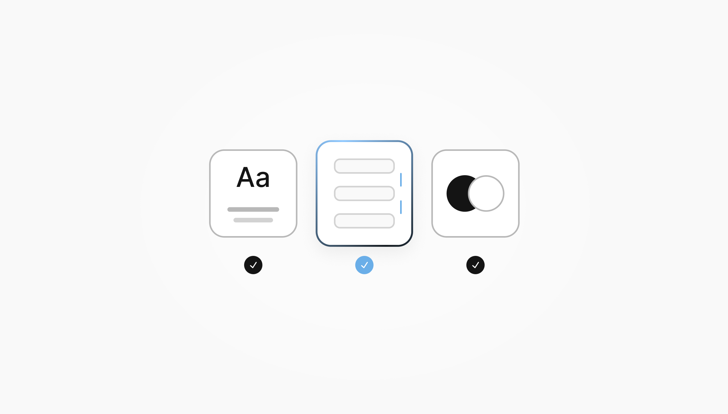
Color, texture, and contrast can draw attention to important items or help less important elements recede into the background. It’s better to decide what each treatment means before applying it across the product, so the same visual cue carries the same meaning on different screens.
Your primary action should be easy to find. Error messages should explain what needs attention, and secondary information should remain readable. Texture and decorative surfaces work better in a supporting role, where they add visual detail without competing with the content.
You should judge these choices together on the complete screen. When every element is trying to stand out, the user still has to decide where to look.
How to apply UI design best practices with Material UI
Material UI best practices start with a few shared decisions: how the theme represents your brand, which component variations your team uses, and how those components behave in a real task.
Here’s how the general rules translate into design work:
| UI principle | Material UI application | What to check |
|---|---|---|
| Keep it simple | Choose components around the task | Does each control have a clear purpose? |
| Stay consistent | Share theme values and component defaults | Do equivalent actions use the same variants? |
| Give the layout a purpose | Adapt grouping and spacing across screen sizes | Does the reading and action order still make sense? |
| Use color deliberately | Define shared colors and state treatments | Can people distinguish the main action and errors? |
| Explain what happened | Design feedback for forms and actions | Is it clear what to fix, what is saving, and what finished? |
| Make controls usable | Check labels, keyboard focus, and error messages | Can someone complete the task with a keyboard? |
Set shared theme and component rules
Material UI’s theme gives you a place to define the colors, typography, spacing, and component shapes your team will reuse. With themed components, you can also set shared defaults and style rules, so a developer adding a component has a common starting point.
For example, your team should agree on the main button treatment, the field variant used in forms, and when a smaller component is appropriate. Writing those decisions down gives the developer adding the next screen something to follow instead of another round of guessing.
Choose the right scope for customization
How widely should a change apply? The answer helps you choose whether to adjust one instance or define a rule for a larger part of the product.
Material UI’s customization guide describes several options:
- A change to one instance: you can use the
sxprop for a local adjustment, such as the spacing around a component. - A variation you’ll reuse: a reusable component built with the
styled()utility gives you one definition to use in different places. - A shared product rule: theme defaults or overrides let you apply the rule to the components it should affect.
A one-off adjustment is perfectly reasonable when the situation calls for it. If you need the same adjustment across several screens, a shared rule gives your team one definition to reuse.
For more substantial changes, consider a reusable component rather than putting every variation into the global theme. That keeps the customization with the component that needs it and makes the scope of the rule easier to follow.
Adapt Layout and Density to the Task
On a smaller screen, a form may need to use more of the available width or stack its actions vertically. Keeping the fields, instructions, and actions clearly related helps people follow the same task as the layout changes.
Material UI provides customizable breakpoints for adapting layouts. It’s better to base those changes on the content your product needs to display, so fields and messages have enough room to remain readable. Trying longer labels and messages helps you see where the layout needs to change.
Density is simply how much information fits into the available space. A table used for detailed review may benefit from compact rows, while a short form can afford more breathing room. Material UI supports higher density for some components through their size, spacing, or other props. You should check the result on the screen where it will be used, because fitting more information is useful when people can still read it and use the controls comfortably.
Design form feedback and component states
A component’s default appearance is only part of the design. Its other states help people understand which field has focus, where an entry needs correcting, and whether an action is still running or has finished.
Keeping form labels visible helps people check which field they’re editing, while instructions beside an input explain what belongs there. Material UI’s Text Field component supports helper text and an error state, so an invalid email can have both a visual treatment and a message explaining what to correct.
A saving indicator and clear completion feedback let users see whether their changes are still processing or have finished. Disabled controls should also look distinct, with an explanation of any requirement the user needs to meet before they become available. That gives someone a way forward when an action is unavailable. “What happened?” is a question the interface should answer promptly.
When you customize states, you should scope the styling to the intended component so a change to one control doesn’t spread to unrelated ones. Material UI’s documentation explains how to apply that scope.
Check accessibility in the product context
Trying the task with a keyboard helps you check that you can reach the fields and buttons, see where focus is, and follow the steps in a sensible order.
You should link each input to its label and supporting message in the page’s markup, so their relationship doesn’t depend on where they happen to sit on the screen. The Text Field documentation explains how to make those connections between the input, label, and helper text.
The same review should cover the contrast in your chosen theme, the names of icon-only controls, and whether an error is understandable through its text. A red outline can draw attention to a field; “Enter a valid email address” explains what to do next.
An example of a settings form
Often it's better if you can see a clear example, so imagine a settings page with two fields, Display name and Email, followed by save and cancel actions.
In the first version below, the fields use different shapes and spacing, their labels sit inside them as placeholders, and both buttons compete for attention. There are only two fields, yet the page already has a few decisions left for the user to sort out.
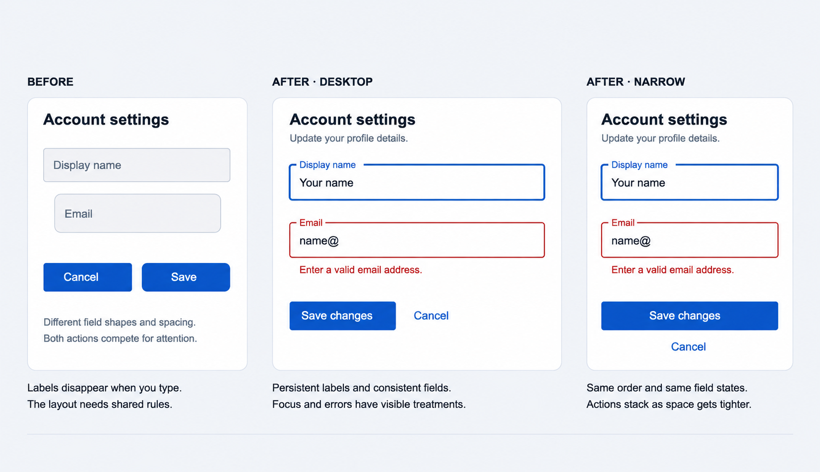
Using the same field variant and spacing rules gives the form a consistent structure, while visible labels let people check what each entry means after they’ve started typing. Save changes should stand out as the main action so it’s clear how to finish the edit. A visible focus treatment shows which field is active, and an email error directly below its field puts the explanation where someone needs it.
On a narrow screen, the fields should stay in the same order so someone following the form still knows what comes next. The actions can stack where needed, allowing the layout to change with the available space while the task remains easy to follow.
Your developer needs the default form, the focus and error treatments shown here, and what should appear while saving and after completion. Including them in the handoff shows how the designs connect to the product’s behavior throughout the task.
A Material UI design review checklist
Before you hand over a screen, this checklist gives you and your developer a shared way to review the decisions:
- User task: the main action and necessary information are easy to find.
- Theme: colors, typography, spacing, and shapes follow shared rules.
- Components: the chosen variants and sizes have a clear purpose.
- Customization: each local change or shared override has the right scope.
- States: the design covers focus, errors, disabled controls, and loading or completion feedback where relevant.
- Layout: fields, messages, and actions work together on wide and narrow screens.
- Accessibility: labels and messages link to their controls; you’ve checked keyboard focus and contrast.
- Handoff: the developer has the component choices, applicable states, layout rules, and a named reviewer for the screen and its states.
It’s good to review the screen as a complete task, too: starting at the first field, making a mistake, correcting it, and finishing the action. Following that sequence helps you check how the pieces work together, including the transition from an error to a completed task.
What is UI design?
A user interface is the point where a person interacts with a computer or application. Screens, buttons, fields, menus, keyboards, and other controls let people give instructions and understand the response.
UI design involves the appearance, usability, interactivity, and overall feel of those interactions. It brings together visual design, interaction design, and information architecture to help people navigate a product and use its features.
The interface also shapes the wider user experience: what people understand, how they move through a task, and how clearly the product responds. That’s why the basic UI rules remain useful even when your team starts with a ready-made component library.
If your product flows are defined and you need help turning them into clear screens and interactions, explore Merge’s UI/UX design services. For shared components and rules that need to work across a growing product, our design system services cover that work.