0
Table of Contents
MVP design process: from discovery to a testable prototype and development handoff
A good MVP design process can help you attract early users and even raise funds.

You have a product idea, a rough sense of who it is for, and a developer or an agency waiting for something to build. The MVP design process is what happens between those two points. This article covers that part: which stages there are, what gets decided at each one, and who signs off.
This guide on how to design an MVP is organized by stages. The calendar depends on the scope, and the scope is one of the things decided during the process. Each stage below has an input, a decision someone has to make, an output you can point to, and an approval that lets the next stage start.
What the MVP design process covers (and what it doesn't)
During design, the team represents the smallest viable release as a testable prototype. The prototype lets target users attempt the core workflow before development; the MVP itself is the working release used to test the product assumption with real users. The MVP design process moves from a problem statement to that prototype and then to a handoff package the development team can implement.
That is a narrower job than "design the product." Most of it is UX: the MVP UX design process covers who the user is, what they are trying to do, which screens and states the flow needs, and what content goes on them. Visual UI is done late in the process and covers only what the MVP needs; a full design system is out of scope.
Three related decisions are outside the scope of this article:
- Which features are included. Deciding what belongs in the first release is a separate exercise; the flows-and-scope section links to our guide on it.
- How to run validation tests. Testing is covered as a stage with a decision at the end; methods for validating an MVP are a separate topic.
- Who should do the work. Whether to use an in-house designer, a freelancer, or an agency is a supplier question, and it does not change the stages.
The process at a glance: stage, decision, output, approval
Here is the whole process at a glance: seven stages, in order. The last column is the reason the next stage cannot start yet.
| Stage | Decision | Output | Who approves | What blocks the transition |
|---|---|---|---|---|
| 1. Inputs and the first gate | Go, narrow the scope, or gather more evidence | One-page product statement: problem, user, constraints, core workflow, assumptions, out of scope | Founder or product owner | Nobody can describe the core workflow in one sentence |
| 2. Discovery and research | How much research the open questions justify | User profiles, problem list, competitor notes, research findings | Founder with the design lead | An assumption the prototype depends on is still untested |
| 3. Flows and scope | Which flow is primary and what gets deferred | User-flow diagram with system states, content and data list, deferred list | Founder or product owner | The team still disagrees about what the MVP is for |
| 4. Wireframes and prototype | What fidelity the test question needs | Clickable prototype of the primary flow with realistic content | Design lead, then founder sign-off | Screens exist, but the flow cannot be clicked end to end |
| 5. UI and design-system choices | Adopt a component library or build one; how much UI the MVP needs | UI for every screen in the flow, all states, component rules | Founder and tech lead | Empty, error, or loading states are missing, or components are inconsistent |
| 6. Testing, iteration, and approvals | Which findings change the design now and which wait | Test notes, change log, list of open assumptions, next review date | Founder | Feedback is recorded, but no decision has been made on it |
| 7. Development handoff | Does the package meet the acceptance criteria | Annotated flows, prototype, states, assets, component rules, open questions, acceptance criteria | Tech lead and founder | Developers are still asking "what happens when..." |
The sections below go through each of these MVP design steps in the same order.
Inputs and the first decision gate
What you need before design starts
Before a designer opens Figma, write down six things. None of them needs more than a paragraph.
- The problem. What the user does today and where it goes wrong. If you cannot say what goes wrong, that is your first research task.
- The target user. One role, described by the job they do. A market segment such as "SMBs" is too broad to design for.
- The business constraint. A budget ceiling, a launch date tied to a funding round, a compliance requirement, a platform you must integrate with. Whatever cannot change.
- The core workflow. The shortest path from the user's first action to the result they came for. Everything else in the design is there to support it.
- Known assumptions. What you believe about the user, the problem, or the market that you have not confirmed. Write them as sentences that could turn out to be false.
- What is out of scope. The features, user types, and platforms you are deliberately leaving out of the first release. Writing this down keeps them from being added back during review.
These six items are the input to every later stage. When the team cannot make a later decision, check these six first.
The decision: go, narrow the scope, or gather more evidence
With the six items in front of you, the first gate is a single decision with three possible outcomes.
- Go. The problem is specific, the user is one role, the core workflow fits in a sentence, and the assumptions are the kind a prototype can test. Design starts.
- Narrow the scope. The core workflow is actually three workflows, or the user is "everyone." Cut until one path for one user remains, then go.
- Gather more evidence. An assumption the whole product depends on has never been checked with a user. Designing now would mean guessing. Spend the time on discovery first.
The founder or product owner makes this call. A wrong "go" here means rework at the prototype stage, when the screens exist and nobody agrees what they are supposed to prove.
Discovery and research
Research depth depends on uncertainty
There is no standard number of interviews for MVP UX research. The depth of discovery depends on how much you do not know.
If you have been delivering this service by hand and have a record of customer complaints, you already have most of your discovery, and a few calls to confirm the workflow may be enough. If you are entering a market you have never worked in, you need to talk to people before a single screen is sketched.
A practical way to size it: take the assumptions from the previous stage, mark the ones a prototype cannot test (pricing sensitivity, willingness to change a habit, who actually makes the buying decision), and plan interviews around those. Each conversation should have a question it is meant to answer. End discovery when the assumptions the next decision depends on have enough evidence and the remaining unknowns are documented, whatever the count.
Discovery can be short when it is focused. For Waffly, an audio player with AI semantic search, Merge's discovery phase consisted of stakeholder interviews and focused competitor research within tight timelines. The case study reports two separate deliverables: a POC within one month and a complete MVP within three months. Waffly's CEO, Val Wikstrem, described it this way:
"Achieving the delivery of a POC within just one month helped us to fundraise our angel round and begin to work on the complete MVP. Within three months through the help of Merge was a remarkable success in my view."
User profiles, problems, product statement
Do the discovery work in this order, and lead the first part yourself.
Start with profiles of the people you expect to use the product: who they are, what their day looks like, and what they need from a tool like yours. Then list the problems they run into, in their words where you have them, and note which of those problems your product addresses. Finish with a product statement: what problem you are solving and why your solution is different from what these people do today. That statement is the reference point for every scope argument later, so keep it to a few sentences and agree on it before moving on.
Competitor analysis: four things to check
Competitor research is the part of discovery you can hand to a designer or an agency and review afterward. Four checks are a useful starting point; add more only when a specific assumption requires it:
- What they do well and where they fall short. Include direct competitors and the adjacent products your user already relies on. The gaps are where your first release can be different.
- How they make money. Pricing pages, plan tiers, what is gated. This shows how competitors package and price the product and whether the model will need explanation; it does not show which plans customers actually buy.
- How they attract and keep customers. Which channels they use, what their messaging emphasizes, what their onboarding requires.
- How a user actually moves through their product. Sign up for the trial and walk the core workflow. Note where you got stuck; that is a design opportunity, and it is the one check worth doing yourself.
Flows and scope
Map the primary flow and system states
Pick one user and one goal, and draw the path from first action to result. That is the primary flow, and making it work is what the MVP is for.
For each step, list the states the screen can be in: empty (no data yet), loading, success, error, partial (some data missing), and permission-denied where roles exist. States that were never drawn become "what happens when..." questions from developers during the build, so list them now.
Content, data needs, and the edge cases worth testing
Every screen in the flow needs content: labels, numbers, names, messages. Write down where each piece of data comes from (user input, an integration, a manual step your team does) and whether it exists before the user arrives.
Then go through the edge cases and sort them. An edge case is worth designing now if the test would fail without it. An edge case can wait only when manual handling is safe, compliant, and accessible and does not compromise data integrity or the core test. Record who will handle it and what evidence will trigger implementation. Keep both lists; the second one becomes the backlog after launch.
What to defer
The deferred list is one of the stage's outputs. Every feature, user type, or platform you push past the first release goes on it with a one-line reason, so the argument is not reopened at the next review.
This article stops at the process and what each stage produces. Deciding which features belong in the release, which can be handled manually, and which wait for evidence is its own decision with its own method, and we go through it in our guide to prioritizing features in MVP design.
Wireframes and the clickable prototype
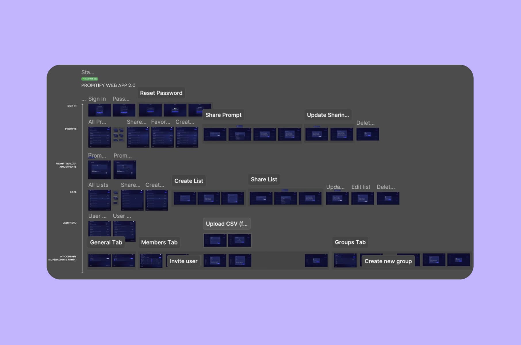
From sketches to user-flow diagrams
Start with rough sketches of the parts of the product the user touches on the primary flow. The point is to show how someone moves from step to step; the look of the screens comes later. Paper or a whiteboard is fine.
Then turn the sketches into MVP wireframes and a user-flow diagram that covers the primary path and the in-scope failure and edge states. Paths you have deferred stay on the deferred list; you do not need to draw every possible route. Look for spots where someone might get stuck or confused: a step that needs data they do not have yet, two buttons that seem to do the same thing, a dead end after an error. Those are easier to fix on a diagram than on built screens.
Choosing prototype fidelity for the question you're testing
The fidelity of an MVP prototype should follow from the question you need answered. It is a decision the design lead should make explicitly.
- Low fidelity (gray boxes, placeholder layout, no visual design) is enough when the question is about direction: whether the flow makes sense to the user, whether the steps are in the right order, and whether anything is missing. It is fast to change, and it keeps the conversation on the flow.
- Higher fidelity is useful when the test question depends on visual hierarchy, realistic content, interaction details, or system feedback. Link the in-scope screens and states needed to complete the primary task; the prototype does not need to simulate the full product. After testing and revision, this version can become part of the handoff package.
Realistic content in the prototype
Once the prototype shows content, make it real-looking: actual product names, plausible numbers, the kind of error message the system would show. With lorem ipsum, layout problems stay hidden (a real customer name is longer than "John Doe"), and test participants treat the screen as a mock-up. Developers also get a sample of the data shapes they will need to support, which shortens the handoff.
UI and design-system choices
Visual hierarchy, accessibility, components
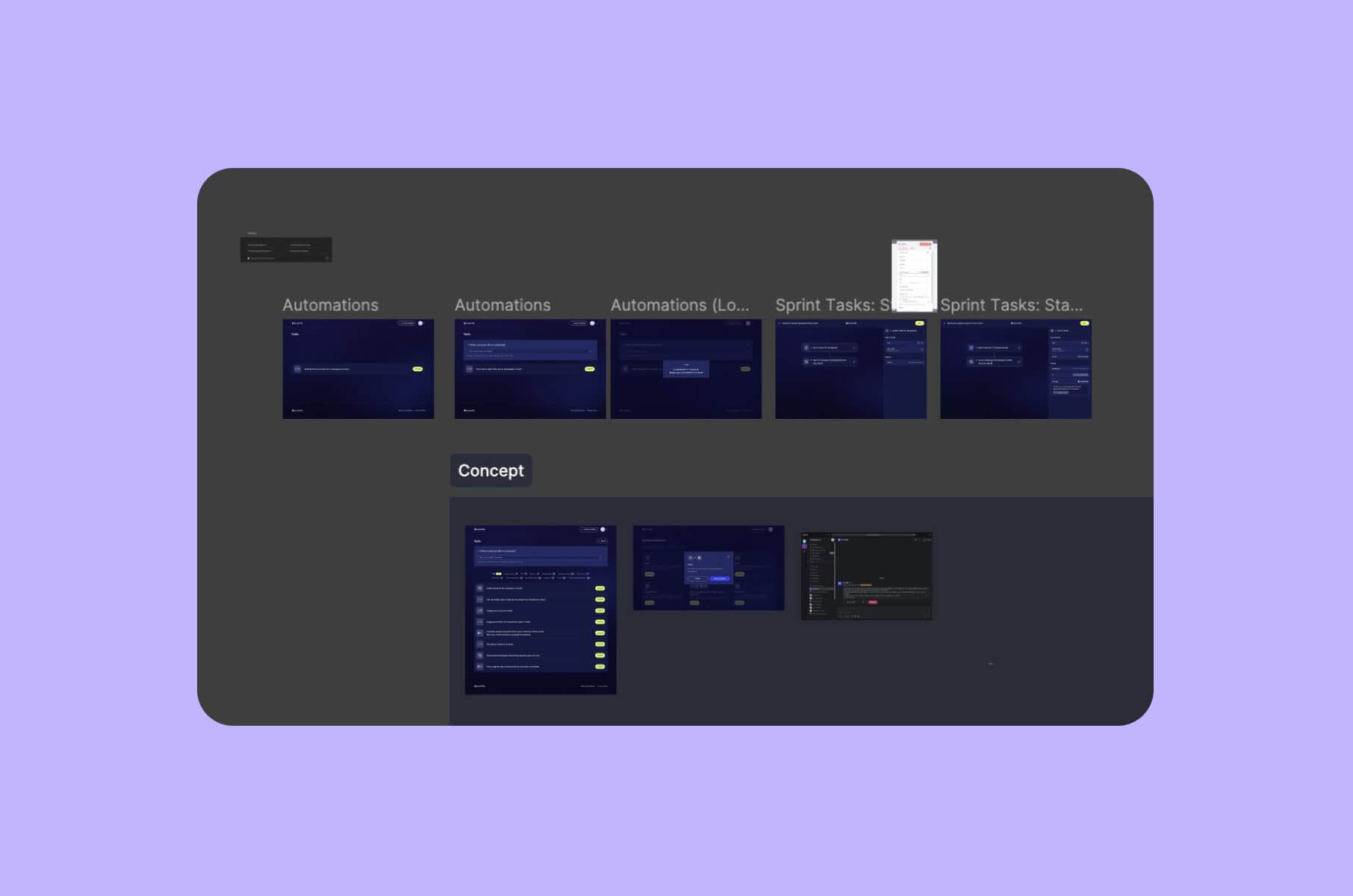
MVP UI design defines how every in-scope screen and state should support the primary flow, including contrast, focus order, labels, keyboard behavior, and error handling. Treat these as implementation requirements and verify them again in the coded product, because a Figma prototype cannot prove keyboard or screen-reader accessibility.
Cover every screen the user will see, and design each one with the transitions in mind: where the user came from, where they go next, what changes on the screen when they act. Keep type, spacing, and color consistent across the whole app, so a user who learned one screen can read the next. Document contrast, focus order, and labels in the design files so they reach the developers as requirements. Keep the realistic content from the prototype; the layout problems you found at low fidelity still exist at high fidelity.
Responsive states, error and success states, edge cases
For each screen, the UI stage produces the states the flow stage listed: empty, loading, success, error, partial. Error messages should say what went wrong and what to do next. Success states should confirm what happened.
If the MVP will be used on a phone as well as on a desktop, design the responsive versions of the screens on the primary flow and note which screens are desktop-only. For a B2B tool, "desktop only for now" can be a legitimate scope decision; it just has to be written down.
Then walk through the edge cases you decided to design and make sure each one has a screen or a state. The ones you deferred get a note in the handoff.
How much UI an MVP actually needs
The MVP needs the screens on the primary flow, in all their states, built from a small set of consistent components. It does not need a custom design system, a brand exploration, or a marketing site's worth of illustration.
The practical option is to start from an established design system or component library and adapt it. It saves time by providing documented components and states, and your designer's time goes into the flow. Treat it as a starting point: verify its responsive behavior and accessibility after adaptation and again in the coded product.
Testing, iteration, and approvals
This stage ends with a decision. You show the prototype to people who match the target user, record what happens, decide what changes now, and write down what you still do not know. The methods for validating an MVP are a topic of their own; here we cover what the design process needs from the stage.
What to ask when you test the prototype
Give the participant a task from the primary flow and watch. Then ask:
- What did you like, and what did you dislike?
- What was confusing or unclear?
- What did you expect to happen when you clicked that?
- What would you do next?
- Is there anything you would need that is not here?
Ask open-ended questions and let the participant talk. Do not explain the design when they get stuck; the stuck moment is the finding.
Sourcing participants
Three ways to find participants without a research panel:
- Closed network. Friends, former colleagues, and referrals from people who know the target role. Ask them to introduce you to someone who actually does the job.
- Social media. A post on LinkedIn or in a community where the target users talk to each other, describing who you are looking for and how long the session takes.
- Direct outreach. As a last resort, find people in the role on LinkedIn and message them directly.
You can offer a small incentive for their time; the amount depends on your audience.
Reading feedback for patterns
Look for patterns across sessions, but treat repeated hesitation as a signal to investigate before changing the design. A single finding may still require action when it exposes a core-workflow, security, compliance, accessibility, or data-integrity risk. Group the observations by step in the flow, count how often each one came up, and separate "could not complete the task" from "would prefer it differently."
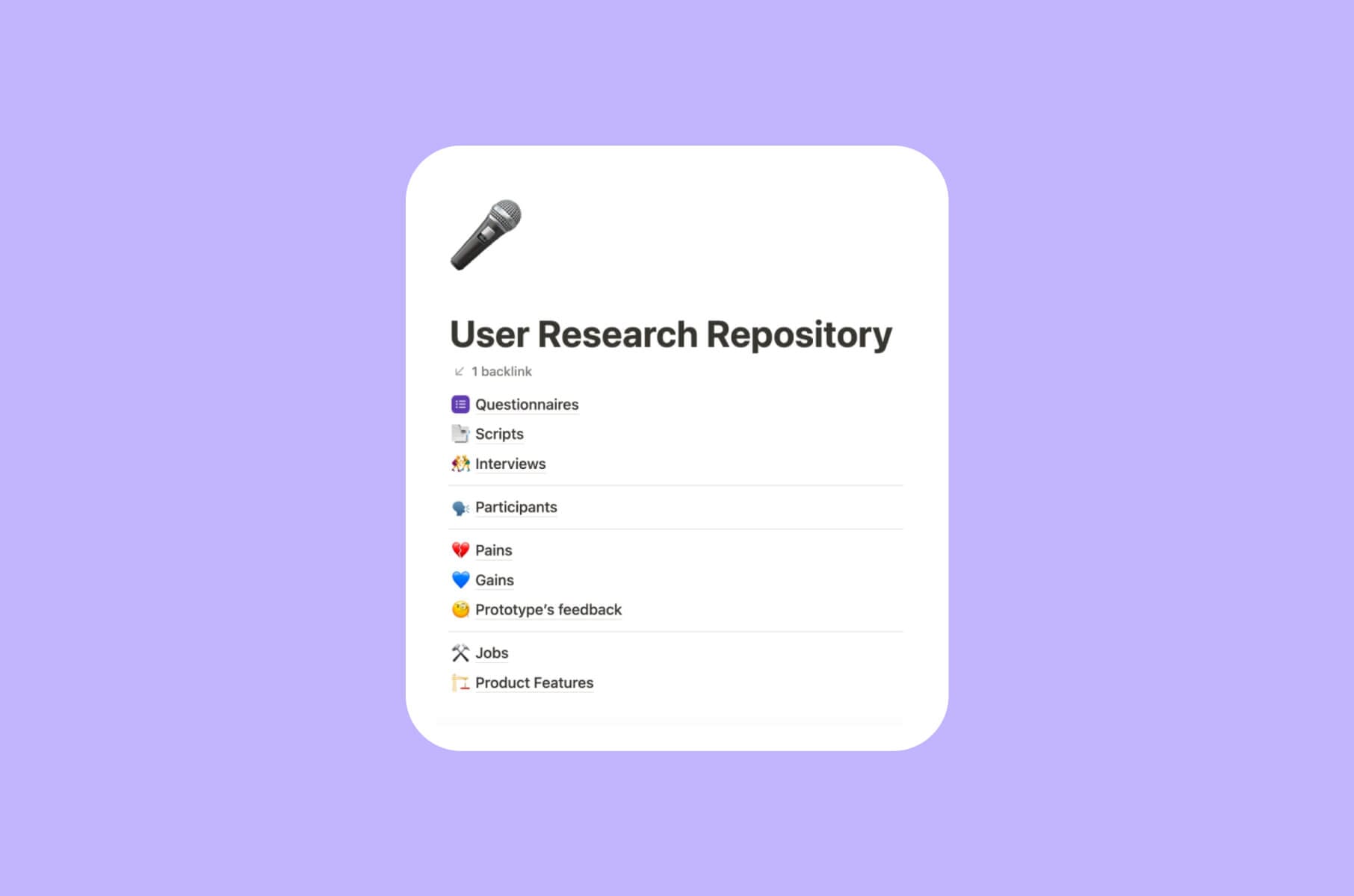
Keep the notes in one place, whatever tool you use. If you want a starting structure, Merge's User Research Repository Kit is a Notion template (email required) for organizing interview scripts, questionnaires, pains and gains, and jobs-to-be-done in one workspace.
Documenting open assumptions and the next review gate
The output of this stage is three lists and a date:
- Changes to make now. Problems that kept participants from completing the primary flow, with the screen or state each one affects.
- Changes to defer. Preferences and feature requests that do not block the test, added to the deferred list with a reason.
- Open assumptions. Things the prototype could not test (pricing, long-term habit, who signs the contract) that the team carries into the build and tests with the live product.
- The next review gate. When the revised prototype gets tested again, or, if the findings were minor, the decision to move to handoff.
In "Why You Only Need to Test with 5 Users" (Nielsen Norman Group, 2000), Jakob Nielsen argues that usability testing gives the best results when you test no more than five users per round and run as many small rounds as you can afford, fixing the design between rounds. For two distinct user groups, he suggests three to four users from each; for three or more groups, three from each. That guidance applies to usability testing of an interface; discovery interviews are sized by the open assumptions, as described above.
Development handoff: a package with acceptance criteria
The handoff is a package the development team either accepts or sends back with questions. Agree on what "complete" means before the designer assembles it, and have the tech lead sign off on it against that list.
What goes into the handoff package
A design-to-development handoff for an MVP should contain:
- Annotated flows. The user-flow diagram with notes on each transition: what triggers it, what the system does, what the user sees.
- The clickable prototype. The version that was tested, updated with the changes from the last round, with a note on what changed and why.
- Every state for every screen. Empty, loading, success, error, partial, and permission states, each linked to the screen it belongs to.
- Assets and specs. Exported icons and images, type and color tokens, spacing rules, and the responsive breakpoints in scope.
- Component rules. Which components exist, how they behave (hover, focus, disabled, validation), and which library they map to if you adopted one.
- The deferred list and open assumptions. These tell the developers what is deliberately absent and what the team still needs to learn.
- Acceptance criteria. For each step in the primary flow, what "working" means in terms a developer and a QA engineer can check.
If you want a one-line MVP design checklist for this stage: the handoff is complete when the team can plan, build, and test the agreed primary flow without unanswered material questions, and the known unknowns are documented with owners and review points.
Open questions the team should carry into build
Some questions cannot be closed in design and should not be hidden. Write them into the handoff:
- Which edge cases will a person handle manually for the first users, and who is that person?
- Which data will be real at launch, and which will be seeded or entered by the team?
- Which assumptions from testing are still open, and what will the live product need to log to test them?
- Which screens are desktop-only for now, and when does that get revisited?
These are the items the tech lead and founder agree on at the gate. Once they are written down, the developers can plan around them.
If the validated concept needs a team to take it from prototype to working software, Merge can carry an MVP from discovery through development. Its approach covers discovery, prototyping, prioritizing, and development. The accepted handoff gives the team what it needs to plan and implement the agreed scope.
How long does this actually take?
It depends on the scope, and a number quoted before the scope is known is a guess.
A four-week version of this process is an illustrative planning scenario; a real estimate for your project depends on its scope. The scenario is possible only when all of the following hold:
- one core flow for one user role, with no second product (an admin panel, a partner area) in the first release;
- discovery inputs that already exist: you have talked to users, you know the workflow, and the assumptions are the kind a prototype can test;
- decisions made the same day they come up, by a founder who is available for reviews at each gate;
- a small team: one designer and the founder, with a tech lead available for the handoff;
- no external review cycles (compliance, legal, a partner's brand team) inside the design window.
Changing any of those conditions can lengthen the schedule, either by adding a second flow to design or by adding a wait between stages.
Two Merge projects show how wide the range is.
For NFTBull, an NFT trading and portfolio terminal, the engagement started with product UX discovery and covered MVP design for the web app, mobile adaptations, branding, a pitch deck, social media assets, and a Webflow website. The case page reports that the MVP design and the Webflow website were delivered within a 2-month window.
For Versus Trade, a CFD broker with two products (a client area and a partner area) plus two marketing sites, the scope was a different size altogether. As the case study puts it: "Across nine months, we designed more than 3,000 responsive screens: client area, partner area, dashboards, funding flows, tables, and reports." The MVP went live in nine months, and the public website followed in two. Versus Trade launched on schedule; the schedule was set by the scope.
Both are real timelines for real scopes, and neither is a benchmark for yours.
FAQ
What is an MVP in design?
An MVP is the smallest working release that lets target users complete the core workflow and generates evidence about a product or business assumption. During design, the team represents that release as a testable prototype before it is built; the prototype and the MVP are two different artifacts.
What is MVP methodology?
MVP methodology is the practice of releasing the smallest working version of a product that can test a business assumption, measuring how real users respond, and using what you learn to decide what to build next. The design process in this article is the part of that loop that happens before the first release exists.
How to build an MVP step by step?
Building an MVP starts after the design handoff described here, and the order in which you build the features is a separate decision, which our guide to what to build first in an MVP and why covers.
What's the difference between an MVP and an MMP?
An MVP is the smallest working release used to test a core assumption, while an MMP (minimum marketable product) is the smallest release with enough value, quality, and market readiness to sell to a defined audience.
Next step
If you would like a second opinion on your assumptions, your first-release scope, or how the design will be handed over to a build team, tell us where the project stands and what is still open.