0
Table of Contents
The design process that keeps startups from rebuilding the same product twice
A good design process for a startup is a risk-management tool.
Most founders we meet have already paid for one version of their product. Sometimes two. They have a working MVP and a small group of users who half-care. Of course, they then ask: "Do we fix this, or start over?" In almost every case, what they're missing isn't engineering talent, though. It's a design process.
At Merge, we've been running product design services for startups for years, and we see the same cause for this rebuild loop - someone skipped the boring early steps of discovery, wireframes, validation, and went straight to UI and shipping.
Today, we'll walk you through the lean design process we actually use, and where founders keep losing money inside it.
Also, if you've already read our deeper product design process explainer, this piece focuses on the cost side - what each step saves you, and what skipping it costs you later.
What is the design process?
The design process is the sequence of steps a team uses to go from a vague product idea to a buildable, validated interface - usually discovery, wireframes, prototypes, UI, validation, and a structured handoff to developers.
That's the short version.
The fuller answer is that the design process is a risk-management tool. Each step lowers the odds that you build the wrong thing or build the right thing the wrong way. Define it as "make pretty screens before development," and you'll rebuild. Define it as "make decisions cheaply, before they get expensive to reverse," and you'll ship.
Overall, the design process meaning comes down to this: it's the part of product development where assumptions get tested with sketches and clicks instead of with payroll. When you skip it, the cost doesn’t disappear. It just moves it to a place where it's 30 to 100 times more expensive to fix (we used a classic Forrester estimate, and it still holds up, in our opinion, even two decades later).
Why do startups keep rebuilding
Imagine this: you have an idea, you hire a freelancer or an offshore team, and ship something in 8-12 weeks. Then the metrics drop, and the next 4-6 months will be spent trying to fix architecture decisions that should have been UX decisions.
This happens because the process of design is invisible from the outside. You can see code or a Figma file. But you cannot really see the internal workings of all the steps it takes to create a product.
For example, CB Insights says roughly 35-42% of startup failures come down to "no market need." On the surface, that looks like a marketing verdict, but what you’ll find is a discovery problem because nobody checked whether the job the product does exists in anyone's actual week.
So when we talk about the steps of the design process, we're really talking about the cheapest stage to fix something.
Our take on the lean design process
We run the design process as six stages that follow a logical dependency.
Step 1. Discovery
Discovery is the part founders most want to skip but shouldn’t. It's where you stop describing your idea and start describing your user.
The work itself involves stakeholder interviews, a small batch of user interviews (5-12 is usually enough to spot patterns), competitor teardowns, and a one-pager covering what the product is for and what it explicitly is not for.
We use a structured approach in our product UX discovery service, and we wrote about the mechanics of it in our UX discovery deep-dive.
A few things to keep in mind during this step:
- Talk about the user's life, not your idea. This is the core principle from Rob Fitzpatrick's Mom Test, and it's the cheapest insurance you can buy. People will tell you your idea is great. They won't tell you what they actually did last week unless you ask them directly.
- Map jobs-to-be-done, not personas. Personas turn into mood boards. Jobs turn into features.
- Write down what you are not building. A scope document with a whole list is worth more than the list of only the features you keep.
If you walk out of discovery without a clear answer to "who is this for, what job does it do for them, and what's our riskiest assumption?" - go back. Don't move to wireframes yet.
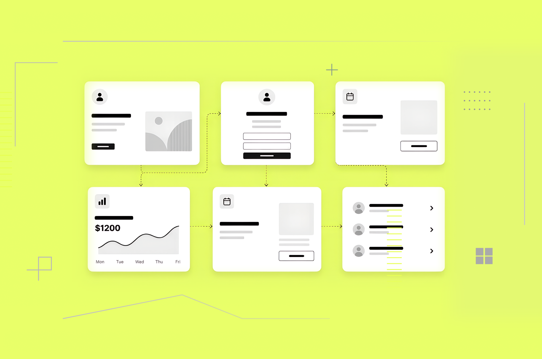
Step 2. Information architecture and wireframes
Once you know the user and the job, the next decision is structure:
- Where does each piece of content live?
- How does a user move between screens?
- What's the smallest set of screens that can do the job?
Wireframes answer this in the cheapest way possible because they're just grey boxes with no colour and no copy, and sometimes even no labels. But that's the point. Wireframes force decisions about hierarchy and flow before anyone gets distracted.
UXPin says this is the stage where most structural decisions get made, and where they're cheapest to change.
For startups, we keep wireframes intentionally simple. If a stakeholder is reviewing a polished mock, they'll comment on the colour of a button. If they're reviewing a grey box labeled "primary CTA," they'll comment on whether the CTA should even be there. The so-called “ugly” version produces better feedback, which is the entire reason we're at this stage.
Step 3. Prototype
Prototypes turn a static wireframe into something clickable. They're the first artefact in the design process where you can put the product in front of a user and see whether they understand it, without writing any code.
There are two prototype fidelities worth knowing about:
- Low-fidelity prototype. Linked grey-box screens, sometimes with placeholder labels. Good for testing flow - can a user get from sign-up to first paid action without getting lost?
- High-fidelity prototype. Polished UI, real microcopy, interaction states. Good for testing perception - does this feel trustworthy enough to enter a credit card?
Pick the lowest fidelity that can answer your current question. Why bother witр a hi-fi prototype at this stage when a lo-fi one would have answered that same question much quicker?
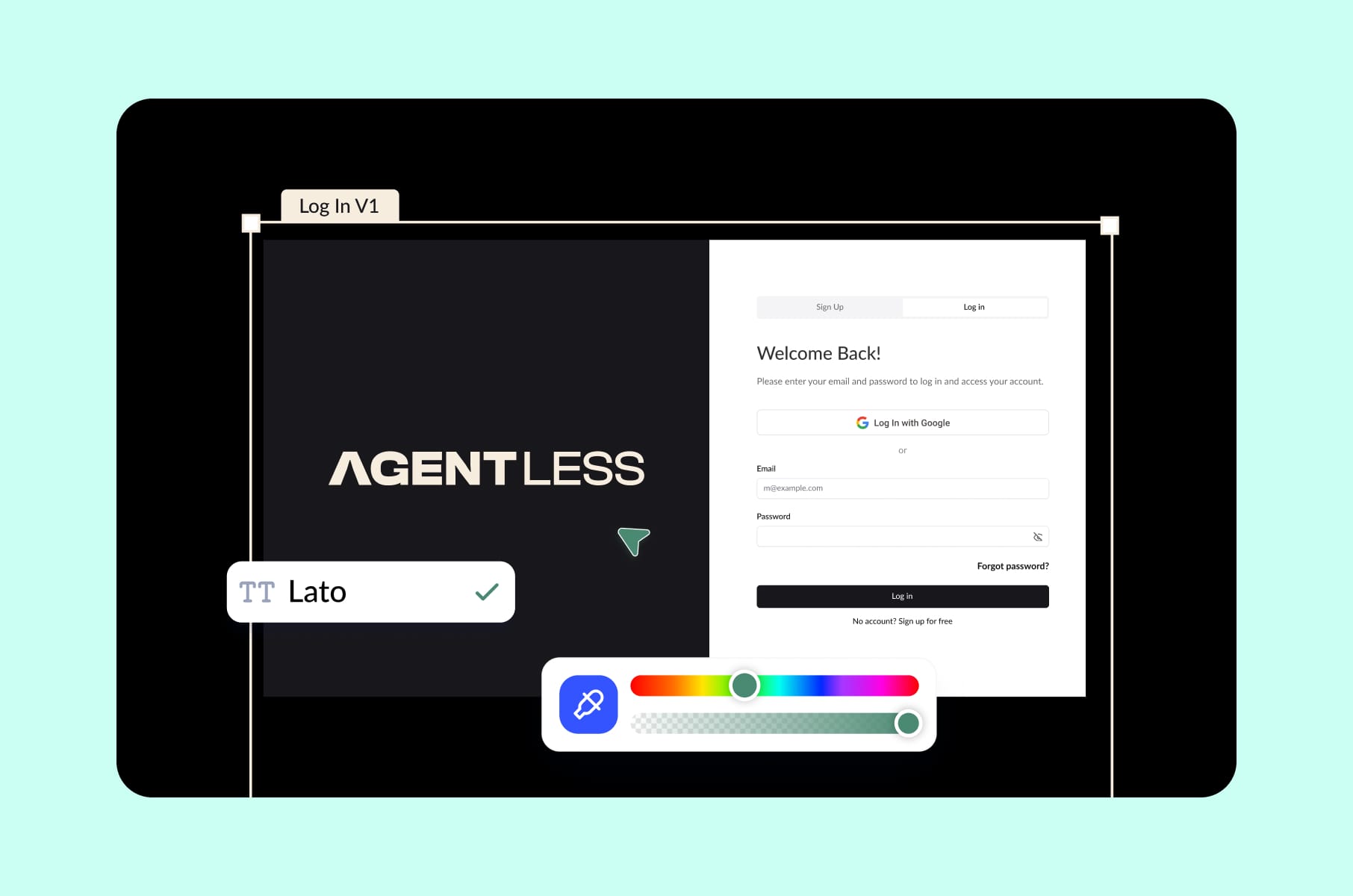
Our work with Agentless is a recent example of this stage paying off nicely. Agentless is a SaaS that helps US home buyers complete purchases without an agent, and the flow involves property research, offer prep, inspections, and state-specific agreements. If we had gone straight to development, it would’ve shipped a beautiful but confusing product. Instead, prototypes let us pressure-test the entire end-to-end flow with real buyers before a single state-specific form template was coded. The buyer-confidence number we cared about moved before launch, not after.
Step 4. UI design
UI is what everyone thinks of when they hear "design," but it's also the step most teams over-invest in too early. The job in this phase is to take the validated prototype and dress it with typography, colour, iconography, motion, and the visual rhythm of your interface.
For B2C products with a strong brand promise, UI is doing a lot of emotional work.
Take the Block Earner redesign, for example. Crypto can feel unsafe, and design has to instill confidence before any feature does. We spent 300+ hours on the website and app interfaces specifically because the brand needed to feel both elegant and trustworthy.
For data-heavy B2B products, it’s doing logical work instead.
With Versus Trade (an asset-versus-asset CFD trading platform with quick flows, RTL support, and data-dense views) UI choices were about reducing cognitive load on traders staring at charts. Same design step but completely different problem, which is part of why we don't believe in one universal design process that fits every product.
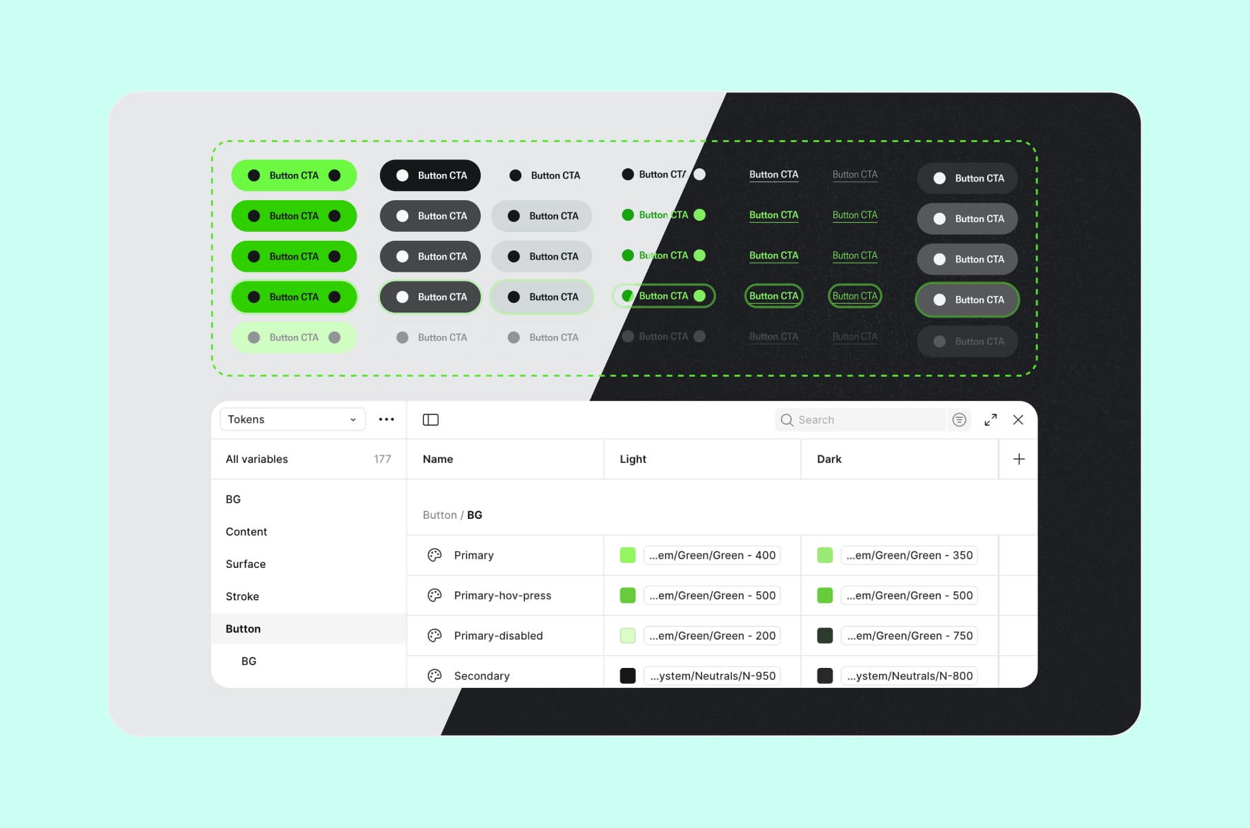
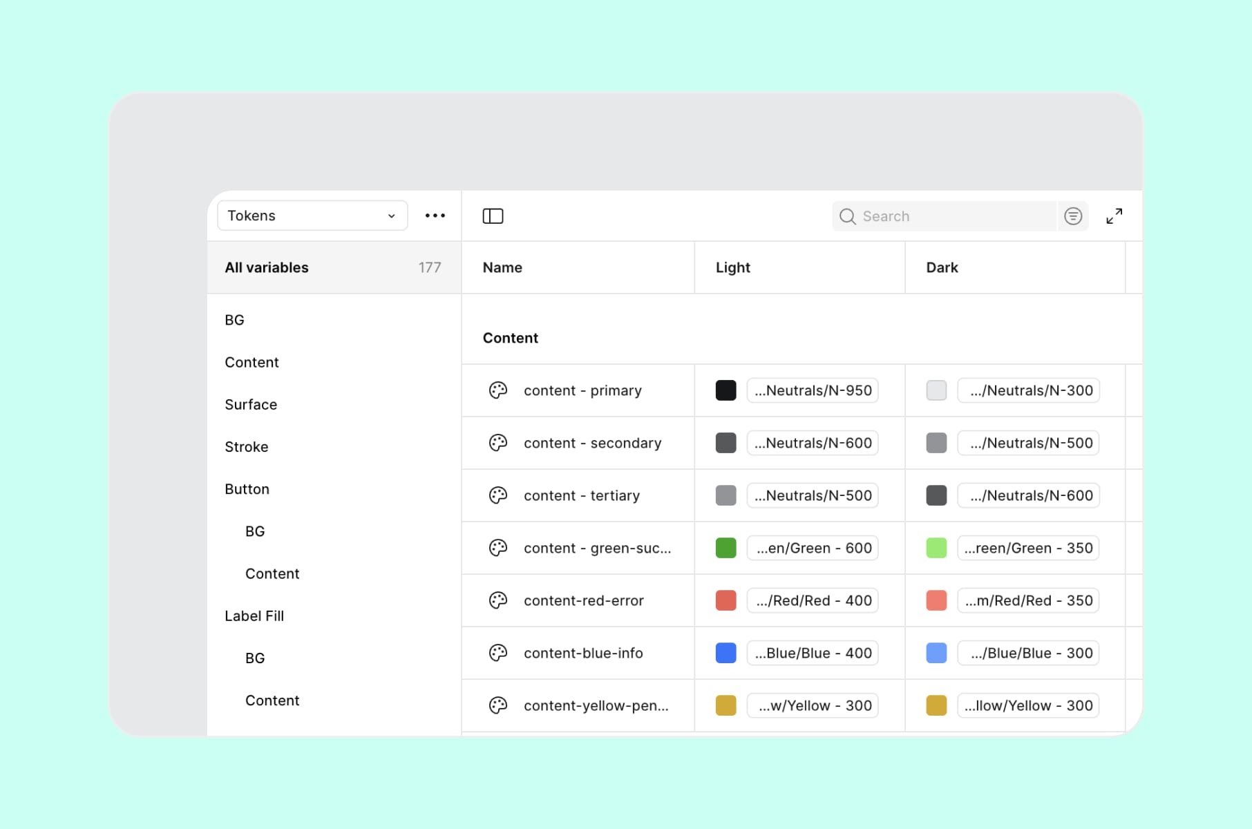
One practical tip from Merge: build the design system as you go, not after.
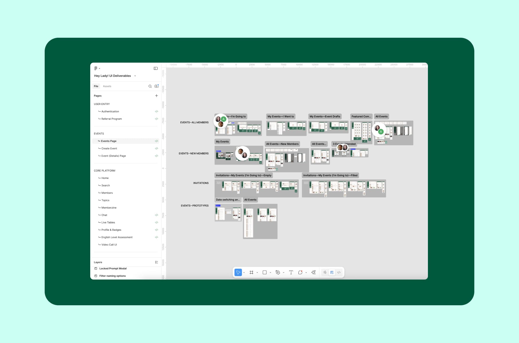
For instance, when HeyLady needed a single source of truth for a fast-moving product, we folded the UI work into a design system effort that, in their team's words, cut rework and aligned teams across chat, Events, and onboarding. A design system earns its keep early. It's what keeps you from rebuilding the same button over and over as the product grows.
If you want a dedicated build of one of these, our design system service is a fixed-scope way to set the foundation.
Step 5. Validation
Validation is the step that decides whether you'll rebuild. The good news is it's also the cheapest insurance.
The basic toolkit we recommend:
- Usability testing with 5 users. The well-known Nielsen Norman finding that 5 users surface ~85% of usability issues holds only for qualitative testing on a roughly homogeneous user group. For quantitative work, NN/G now suggests around 40. For most early startups, 5 is the right number.
- Concept tests with real prospects. Show the prototype, give them a task, then stay quiet and watch.
- Pricing and willingness-to-pay probes. Validation isn't only about the interface. It's about commitment, which the Mom Test framework also stresses.
- Analytics scaffolding in the prototype. Even a tool like Maze or Useberry will show you where users drop off in a clickable flow.
Validation is also where we bring in our user research service for clients without an internal research function. One recorded session of a user struggling through your onboarding will reshape the backlog faster than any meeting.
Also, a bit of nuance - validation runs in parallel with steps 3 and 4, not just once at the end. You test the prototype flow first, then UI clarity, then the copy. By handoff, the riskiest assumptions have each been through two or three rounds.
Step 6. Developer handoff
Handoff is the step where, if the quality drops, the design itself is usually fine - what failed was the communication around it.
A clean handoff usually includes:
- A finalised UI file with components, not just screens.
- A linked prototype with interactions, transitions, and edge states.
- A documented design system or token set. Colour, spacing, type, motion.
- Annotations for the weird stuff. Animation curves, async behaviour, copy that depends on user state.
Figma Dev Mode has changed the rhythm of this step over the past couple of years. As Figma's own handoff guide outlines, developers now read the design directly inside the tool, with measurements, tokens, and code snippets surfaced automatically. It's a real improvement. Paired with a tight checklist (we keep ours in the ultimate UX design hand-off checklist), it cuts out most of the back-and-forth over ambiguous specs and undocumented states.
If you don't have an internal team and want this stage to feel boring (which is the goal), our UI/UX design services include handoff packages built for dev teams to pick up without a three-day onboarding meeting.
Niche tips we wish more founders knew
A few tips and patterns that don't usually make it into "design process for startups" articles but really should.
- Cut the design system from the MVP scope, but reserve tokens and a small component library. As we discussed in our article on what to build first in an MVP, you don't need a full system on day one. What you do need is enough tokens and shared components that the next person to touch the product inherits your spacing and colour decisions instead of re-guessing them.
- Validate copy as hard as you validate UI. Copy moves more conversions than colour, and it's the cheapest variable to test. Run a one-day copy review with real users before you lock the hi-fi.
- Design your empty and error states first. It sounds backwards until you watch a recording of someone hitting a dead end. A product that handles its empty and broken states well feels more finished than one with gorgeous happy paths and nothing underneath.
- Don't outsource discovery if you can avoid it. Even when Merge or another agency runs the process, founders should sit in on at least five user interviews themselves. The pattern recognition you build in those rooms feeds every later decision.
- Pick a "north star" metric before UI starts. For Capable, it was cutting user clicks and confusion to lift retention. For HeyLady, it was a time-to-first-conversation. The metric tells UI what to optimize for.
How Merge runs the design process
When teams hire us, the process of design is built around one question: what's the cheapest stage at which we can answer this risk? That's quite abstract, we agree, so here's how it plays out.
For early-stage startups with one risky assumption, we'll often start with a design sprint service to get from problem to tested prototype in a single week. It's especially good when the real question is "Does anyone want this at all?"
For startups with a validated idea but no design partner, the full design process is more deliberate. We offer discovery, IA, wireframes, prototype, UI, validation, handoff, and it takes usually 6-12 weeks for an MVP-sized product. Our POC design service sits at the front of this for founders who need a clickable artefact for investors before building.
For scale-ups inheriting a messy product, we'll often start with a SaaS product redesign service, which begins with a discovery pass against the current product to figure out what's salvageable and what isn't. Most of the time, less needs tearing out than the founder feared.
Wrap-up
To recap, the difference between a startup that ships once and with success and a startup that keeps rebuilding is whether the design process did its job.
Discovery tells you whether the thing is worth building, wireframes whether the structure holds, prototypes and validation whether users actually get it. UI and the design system carry the product to scale, and handoff carries it into engineering without rework.
You don't need to do every step perfectly. You do need to do them in the right order, and at the right fidelity, before the code becomes the most expensive place to change your mind. The teams we've worked with at Merge share this habit.
If you want a partner who can run this process with you or take it off your plate entirely, our product design agency has been doing exactly this for founders at the Angel-to-Series-B stage for years. Have a look at our design and development case studies, or just reach out - we'd happily talk through the riskiest part of your product before you write another line of code. Stay tuned for more!
FAQs
What is the design process in simple terms?
The design process is the structured set of steps a team uses to turn a product idea into a validated, buildable interface. For most startups, it has six stages: discovery, information architecture and wireframes, prototype, UI, validation, and developer handoff. Its job is to make the riskiest decisions in the cheapest possible way, which are sketches and clicks, not code.
What are the steps of the design process?
The most common version of the steps of the design process for startup product work breaks down into six stages:
- Discovery. Research the user and define the problem.
- Wireframes and IA. Decide on structure and flow.
- Prototype. Make the design clickable.
- UI design. Apply visual style and a design system.
- Validation. Test with real users.
- Handoff. Transfer the artefacts to developers.
What is the design process for startups specifically?
For startups, the design process is leaner and faster than at enterprises. Discovery is smaller (5-12 users instead of 50). Wireframes stay intentionally low-fidelity. Prototypes get tested with a handful of real prospects rather than statistically significant samples. None of the steps get skipped - each one just runs at the lowest fidelity that still answers the question you have.
How long does the design process take?
For an MVP-sized product, a focused design process usually runs 6-12 weeks. A design sprint compresses the most critical risk into one week. A full product redesign for a scaled product can run 3-6 months. Team size moves these timelines less than founders expect. Decision speed on scope moves them most.
How is the design process different from the development process?
The design process decides what to build and how it should work for the user. The development process implements it. The reason this distinction matters is cost. Decisions made in the design process are roughly 30-100 times cheaper to change than the same decisions made in production code.
Can a startup skip the design process and still ship?
Yes. We've seen it many times. They ship once, watch the metrics underperform, and then either rebuild or quietly die. Skipping the design process doesn't save money. It moves the cost from a $1 stage to a $30 or $100 stage. For founders short on runway, that move is the exact wrong trade.
What's the design process meaning in product work versus industrial design?
Industrial design has its own famous process - the Double Diamond, IDEO's design thinking, and others. Product design process for software borrows from these but adds steps specific to digital: information architecture, design systems, developer handoff. The shape is similar (research, ideate, prototype, test), but the artefacts and the loop length are different.
How do you know if you need to start the process of design over?
You probably don't. Most startups that think they need a rebuild actually need a structured discovery pass against the current product, followed by surgical fixes. Our product redesign service almost always begins with that diagnosis. Full rebuilds are rare, but strategic rework is much more common.