0
Table of Contents
User testing methods: how to choose the right approach for your product
Pick the question, then the method. Give the results a little judgment, too.
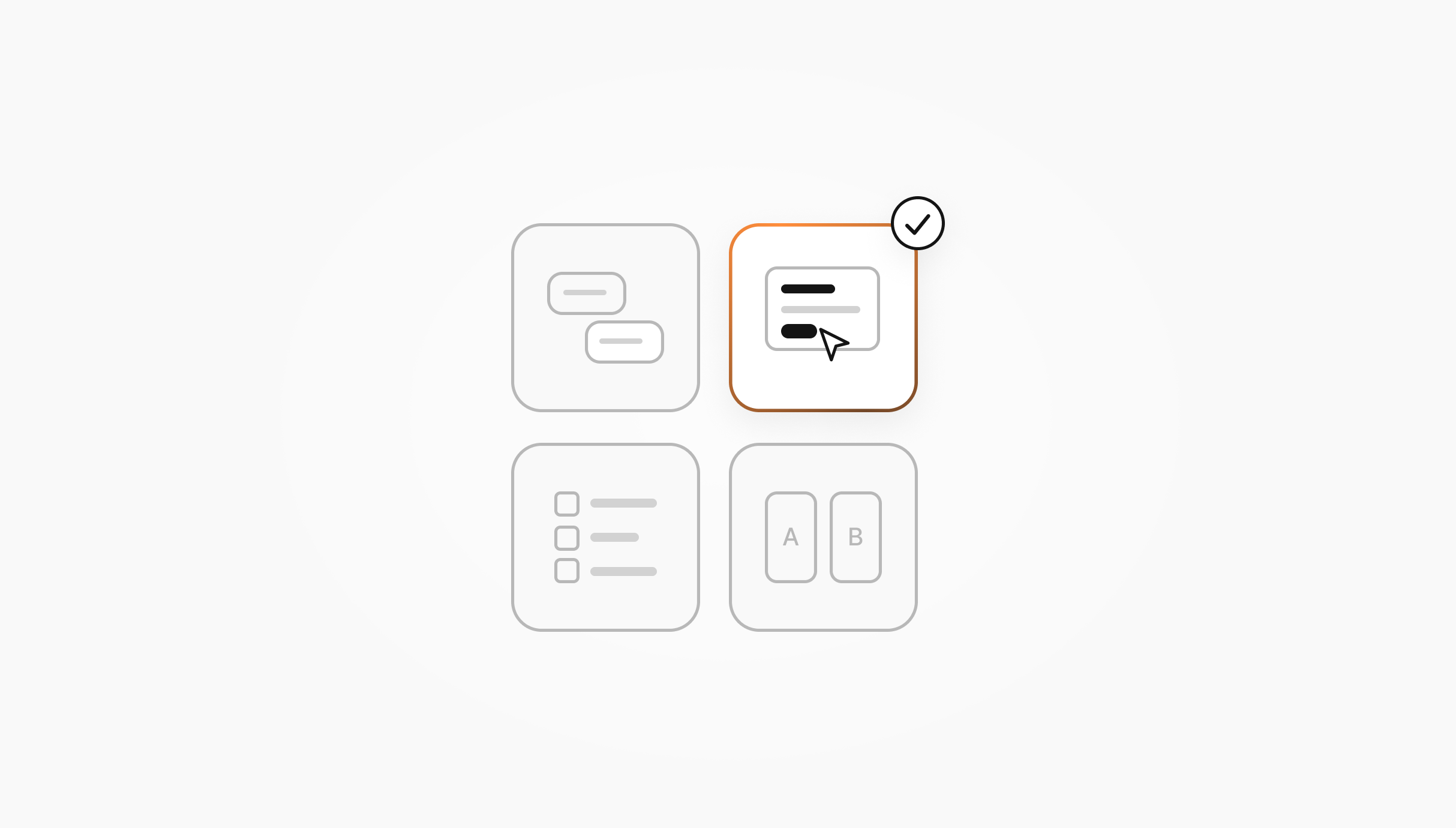
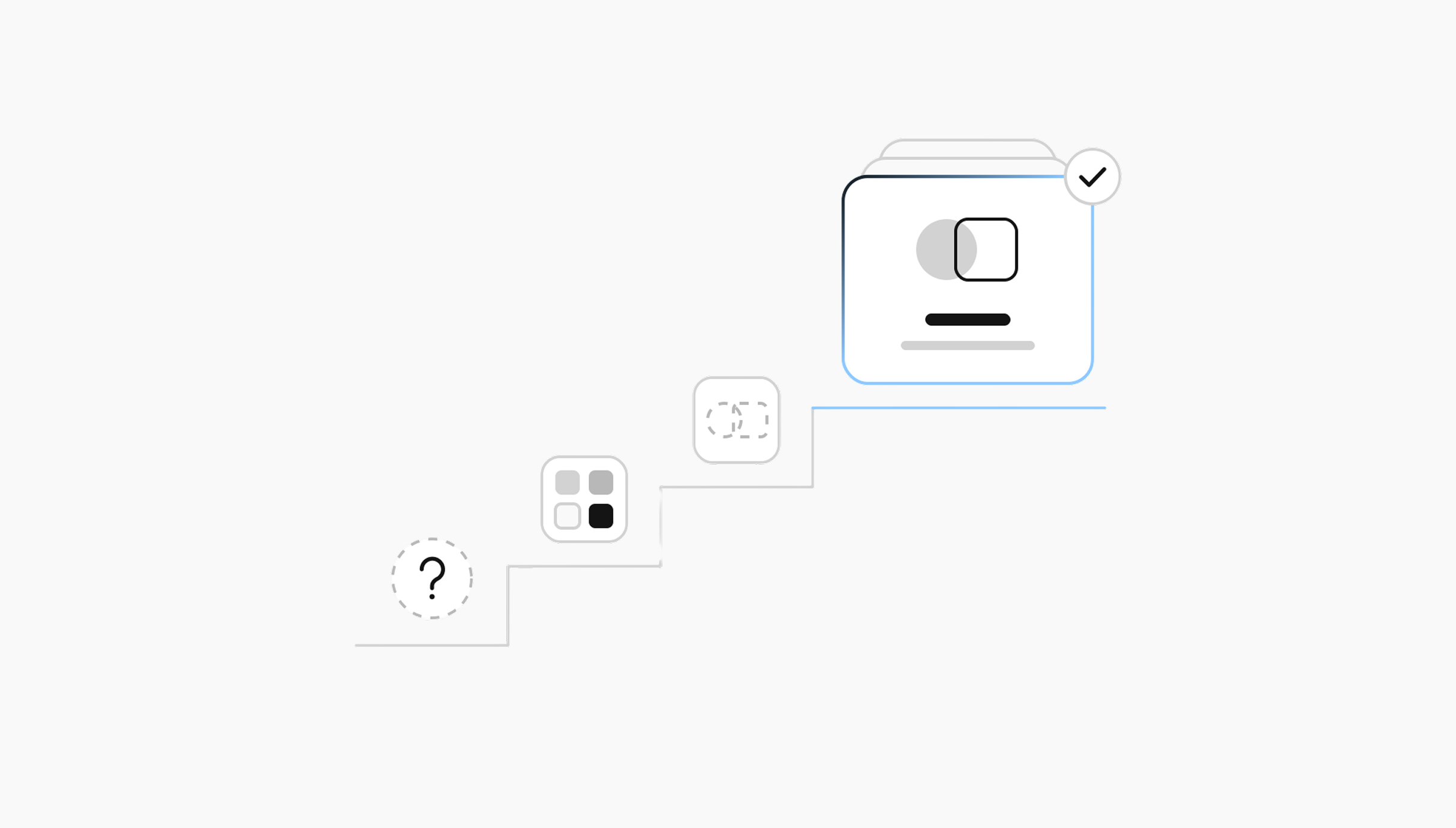
In pretty much every product team's life, there's a moment when the question shifts from “should we test?” to “which test should we actually run?” You might need to find out whether people understand a new idea or why they get stuck in a flow you've already built. Knowing what you need to learn helps you choose a method and plan where to spend your time and budget.
We are Merge, a product design agency for SaaS and fintech. We have already published a deeper take on user research as a discipline, as well as a separate breakdown of the UX audit and what it involves. Today, we're going to dig into the testing half of the story.
If you're a founder or a product lead trying to figure out which user testing methods fit your stage, your audience, and your budget, this article is for you. We'll cover:
- What the different methods can tell you, and where their answers stop.
- When moderated or unmoderated testing makes sense.
- How to test a mobile experience on actual phones.
- Where a competitive audit fits, and when you need people to try the competing products themselves.
What user testing methods actually are
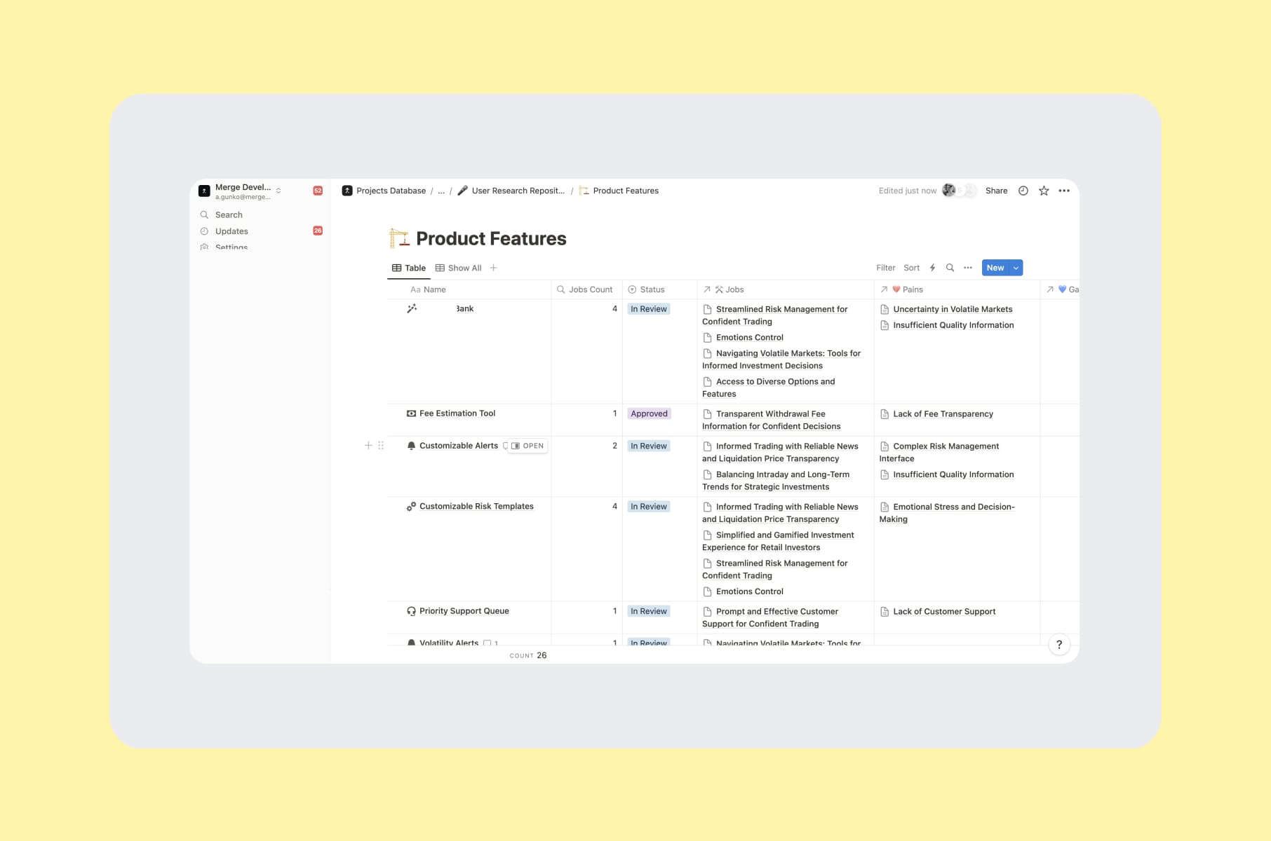
User testing usually means putting a design, a flow, or a feature in front of people who resemble its intended users and finding out how it works for them. With a wireframe, a prototype, or a live product, that often comes down to a fairly practical question: can someone do the thing they came here to do?
Usability testing is the task-based part of that work. You give someone a realistic goal, observe what they do, and record where the experience helps or gets in the way. As Nielsen Norman Group explains, the tasks, participants, and way you facilitate the session all affect what you can learn.
User research is the wider discipline. It also includes finding out what people need before you have a solution to show them. There is room for both in a product's life, and the same project may move between them.
You'll encounter several kinds of decisions:
- Evaluating use. Can someone complete a task, find a feature, or understand how to recover from an error?
- Evaluating an idea. Does a proposed concept make sense to the intended audience, and does it address something they care about?
- Comparing alternatives. Which navigation is easier to use, how do competing products handle the same task, or which live variant performs better against a defined metric?
Those questions call for different evidence. A positive reaction to a concept doesn't tell you whether its eventual interface will be usable. A preference between two mockups doesn't tell you which one will produce more paid subscriptions.
Choose a method by question and stage
Here is a compact way to narrow the choice before you start shopping for a testing platform.
| Question | Stage or input | Method | What you learn | What it does not establish |
|---|---|---|---|---|
| Do people understand and value the proposed approach? | An idea, description, or storyboard | Concept testing | How people interpret the idea and what seems useful or unclear | Whether they can use the finished interface or will buy it |
| Can the intended user complete a task? | An interactive prototype or live product | Task-based usability testing | Completion, errors, hesitation, and points that need investigation | Population-wide problem rates without a suitable sampling plan |
| Where would someone start? | A single screen | First-click testing | Whether the initial choice leads in the intended direction | Whether the person can finish the whole flow |
| Can people find the right destination? | A navigation structure and labels | Tree testing; card sorting when you need to develop the groups | Findability, or how people group and label content | How the complete visual interface will perform |
| Does a change improve a chosen metric? | A live product with reliable measurement and a suitable sample | A randomized A/B experiment | The difference between variants under the test conditions | Why people behaved that way |
| What happens over repeated use? | An experience followed over time | A diary or longitudinal study | Habits, frustrations, workarounds, and changes in context | That a design change caused a retention outcome |
| How do people complete the same task across products? | Comparable products and tasks | A comparative usability study | Differences in the observed experience | What an expert review alone can establish about real behavior |
A couple of distinctions will save you confusion later. Moderated versus unmoderated describes facilitation. Remote versus in-person describes location. Qualitative versus quantitative describes the kind of evidence you're trying to collect. These are separate choices; an unmoderated study can still collect detailed qualitative feedback. NN/g's research-method framework is a useful reference for these distinctions.
Think-aloud is a protocol you can use within a study. RITE is an iterative way to test and revise a design. A heuristic evaluation is an expert inspection. They can all be useful without being interchangeable types of usability testing.
For a hypothetical example, say you're building a new onboarding flow for a B2B SaaS product. Before making the prototype, you could use concept testing to check whether an admin understands the proposed setup process and sees a reason to use it. Then you could give admins a prototype and ask them to get a workspace ready for a colleague, watching where the setup breaks down.
Once the flow is live, a randomized A/B test could compare a specific change against a defined activation metric, provided the traffic and measurement support that experiment. At each step, you have answered a different question. You haven't proved the entire onboarding works because someone liked the first sketch.
Moderated and unmoderated usability testing
Moderated testing happens with a facilitator present. A researcher runs the session, listens, asks follow-up questions, and can investigate when the user does something surprising.
That last part is handy. Someone may finish the task, yet leave you wondering why they took such a strange route. You can ask what they expected to happen while the experience is still fresh.
The moderator's job is to keep the study moving without steering the person toward the answer. If you need to help someone past a prototype limitation, you should record that intervention so you can distinguish independent task completion from completion after a hint.
In unmoderated testing, the participant follows prepared tasks without a live human facilitator. Depending on the setup, you may collect a recording, written answers, clicks, task outcomes, or a combination. The researcher reviews the results afterward.
This can make scheduling easier and let people participate in their own time. You still have to recruit the right people, write clear tasks, pilot the study, check the recordings, and analyze what happened. The analysis doesn't disappear because nobody hosted the call.
A quick comparison view:
| Dimension | Moderated | Unmoderated |
|---|---|---|
| Useful when | You need to explore an unclear problem, understand a complex flow, or ask follow-ups | The tasks are clear enough to complete independently and you need feedback without scheduling each session |
| Researcher's role | Facilitates live, observes, and probes neutrally | Prepares and pilots the study, checks data quality, and reviews the results |
| Participants per round | Depends on the question, user groups, risks, and whether you need diagnosis or numerical estimates | Depends on those same factors; removing a moderator doesn't determine the required sample |
| Cost drivers | Recruitment, incentives, scheduling, facilitation, tools, and analysis | Recruitment, incentives, platform costs, setup, quality checks, and analysis |
| Time to useful findings | Depends on recruiting, availability, study scope, and analysis | Depends on recruiting, task quality, completion, and analysis |
| Understanding the “why” | Follow-ups can explore a reaction as it happens | Depends on the recorded explanation and any planned follow-up |
| Risk of misunderstood tasks | A moderator can clarify, while keeping track of any assistance | A confusing instruction can affect the entire session without anyone there to notice |
The useful choice is sometimes a sequence. You might begin with moderated sessions to understand an unfamiliar workflow, then use an unmoderated study to check a revised version. Or an unmoderated result may leave you with a pattern worth exploring in a conversation. Pick the order around the uncertainty you have.
When to do moderated
Use a moderator when the question needs probing, the workflow is complex, or the prototype has limitations that participants will need help understanding. This can be a sensible fit for niche B2B audiences, where you want to make good use of each person's time.
Be careful about mistaking guidance for usability. If the study depends on telling someone which button to press, you have learned where they need help, even if they eventually reach the end.
When to choose unmoderated
Use unmoderated testing when the task can stand on its own and the design is ready for someone to explore without you sitting beside them. Onboarding steps, navigation labels, and a focused prototype task can all be candidates, depending on the question.
It's worth piloting the instructions before opening recruitment, so you can spot tasks that participants misunderstand. A perfectly recorded session of someone solving the wrong problem is still the wrong session.
If you want a numerical comparison, plan the sample and analysis for that purpose. A bigger collection of recordings doesn't automatically give you a dependable estimate.
Our example
On our user research engagement for a trading platform, we conducted six in-depth interviews and collected detailed survey responses from four people. The work also included user testing of prototypes and feedback on key flows, alongside a set of 20 proposed feature ideas.
The interviews, survey responses, and prototype work contributed different kinds of information. It is a useful example of combining approaches around a product question, rather than expecting one study format to do every job.
User testing methods and related approaches
So what are you actually picking from when you sit down to scope a study? Here is the working set, including the related approaches that help you decide what to test next.
1. Task-based usability testing
This one is the classic: you give the user a goal, such as “transfer $50 to a friend,” watch them try to do it, and log where they get stuck. Moderated or unmoderated can both work.
A useful measure is task success: whether someone completed the task under the conditions you defined. You should decide what counts as success before the sessions so you can record completion, partial completion, and any help from the moderator consistently. Errors, time, and hesitation can add context.
A completion rate needs that context, too. A task-success benchmark drawn from other studies doesn't give you a universal pass mark for every flow. The task's difficulty, the people doing it, and the consequences of failure matter. When people struggle, investigate what stopped them before deciding whether the fix belongs in a screen, a label, or the flow itself.
2. Think-aloud protocol
How about asking the user to narrate what they're doing? NN/g describes think-aloud as a way to hear what people are thinking as they work through an interface.
“Talk through what you're looking at” can reveal an assumption that the recording alone would miss. Perhaps someone has been searching for an invoice because they think your “billing” section only manages payment cards.
Think-aloud has limits, though. Talking while doing a task can change how someone performs it, so take care when interpreting timing. You can also use a retrospective walkthrough: watch the recording afterward and ask, “What was happening here?” Choose the approach around what you need to understand.
3. First-click testing
You can check whether a screen points people toward the right starting place by showing it to participants, giving them a goal, and recording their first click.
First-click research discussed by MeasuringU connects the initial path with eventual task success. That makes it worth examining, but the first click gives you one part of the journey. Someone can choose the right entry point and still get lost on the next screen.
Landing-page CTAs, onboarding screens, and dashboard entry points are useful places to consider it. If the uncertainty is what happens after that first choice, test the wider task.
4. Tree testing and card sorting
Card sorting and tree testing answer related questions. In a card sort, people group content into categories that make sense to them. In a tree test, you give them a navigation structure and ask where they would find something.
If your information architecture is a bit of a mess, card sorting can help you explore categories and labels, followed by tree testing to check the proposed structure. If you already have a structure and need to investigate findability, a tree test may be the more direct next step.
You may also need to test the visual interface, because a sensible category name can still be hidden inside an unhelpful menu.
5. A/B and multivariate testing
A/B testing compares variants against a defined outcome. For a live product experiment, you assign users to the variants and compare the chosen metric under the test conditions.
It is useful when you have a specific change to evaluate and enough suitable traffic to measure the difference you care about. Reliable instrumentation, allocation, and a sample plan belong in that decision. Running two variants for a while and picking the larger number is a rather optimistic analysis plan.
Multivariate testing looks at combinations of changes to multiple elements. It needs its own experimental design; adding more versions doesn't make a test more informative by itself.
Qualitative research can help you decide what is worth testing and investigate why a variant might behave differently. If you have little traffic and an unclear problem, a moderated usability session may be a more useful starting point than an experiment that cannot support the decision.
6. RITE (Rapid Iterative Testing and Evaluation)
Here, you run a session, fix a clear problem, run another session against the revised design, and repeat. It's useful during prototype work, when changing a screen is still relatively straightforward.
You should record which version each person tested and why you made each change so you can trace their feedback to the right design. That helps you check whether the revision addresses the original problem and whether it introduces another one.
This is an iterative approach to evaluation, so the cadence should fit the work. It doesn't require a particular number of fixes or a promise that every problem will be solved as quickly as possible.
7. Diary and longitudinal studies
For products used over days or weeks, such as productivity tools, fitness apps, or B2B dashboards, a point-in-time test can miss part of the experience. Diary and longitudinal studies help you follow what happens over time.
Asking participants to record relevant moments gives you concrete examples to revisit when you follow up on their habits, workarounds, and slow-burning issues. A workflow might seem manageable in a first session and become irritating when someone repeats it throughout the working week.
The effort depends on the study's length, the recording tasks, and how much support participants need. Plan for that commitment. A missed diary entry is something to investigate, rather than quietly filling in the gap yourself.
8. Concept and preference testing
Concept testing explores how people understand a proposed idea and whether it addresses something relevant to them. You can work with a description, sketch, or storyboard before a detailed interface exists. NN/g's methods glossary is a useful reference for the distinction.
Preference testing asks which alternative people prefer and why. That can help with visual direction, messaging, or competing approaches inside a product, provided you understand what the preference represents.
Two designs, one question, dozens of opinions. There is a place for that. Just be clear whether you're learning about appeal, comprehension, or the ability to complete a task. Someone's favorite mockup may still be the one they struggle to use.
9. Heuristic evaluation
Technically, this is an expert inspection without users taking part. An evaluator reviews the interface against principles such as Nielsen's ten usability heuristics and identifies potential problems.
It can help you spot issues with feedback, consistency, error prevention, or navigation before deciding what to test with people. The resulting observations are expert findings; a user study can investigate how those issues affect the intended audience.
That distinction matters when you choose the next step. An expert can flag a confusing pattern, while observing people attempt the task gives you evidence about what they actually do with it.
Remote mobile usability testing
Remote mobile usability testing lets people try an experience on their own phones while you observe live or review the session afterward. The trap is assuming “remote” automatically means “good.” It really doesn't.
You need to see enough of the interaction to answer the question, and participants need a setup they can actually use. A recording tool that interferes with the task can leave you studying the recording tool instead.
The basic setups to consider:
- Mobile testing platforms. Recording, installation, and permission requirements vary by tool and study type, so you should check whether a platform's workflow supports your prototype, mobile website, or app on the participant's device before choosing it.
- Phone screen sharing on a video call. Trying the screen-sharing and audio setup beforehand lets you check whether you can see the participant's phone screen and hear them clearly, especially if they'll also join from a laptop.
- Production session recordings. These can help you spot behavior worth investigating, such as repeated navigation or abandoned steps. They supplement a planned user study, where you know the person's task and can ask about it.
- In-context observation through a second camera. A view of the person's hands and surroundings can help when the physical interaction matters. It takes some preparation, so make sure the extra setup serves the study.
For a concrete example of why checking the workflow matters, Maze's App Test documentation requires mobile participants to use its Participate app. In that workflow, selecting screen recording turns off the camera option. “It records mobile sessions” doesn't tell you everything about what you will be able to observe.
A few practical things to plan for:
- Mobile testing exposes constraints a desktop preview can hide. Thumb reach, glare, micro-distractions, the kid in the background, and the notification banner mid-flow can all become part of the experience.
- Network conditions deserve a place in your notes. Record the connection and interruptions that affect a session, so you can distinguish interface confusion from a technical problem. Use a setup that reflects the context you need to study.
- Listen to the language people use. The way a participant describes a small-screen interaction can reveal a mismatch with your labels or instructions. Follow up on that mismatch before changing the copy.
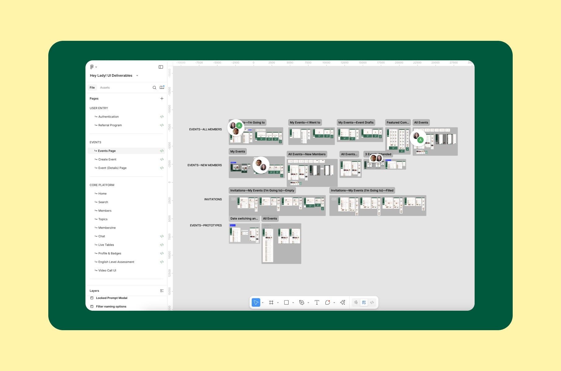
For our HeyLady product design work, research included interviews with the team and members, with Jobs-to-be-Done around finding someone to talk to, preparing for a work opportunity, and building confidence. The design work covered chat, event discovery, and onboarding.
Those are concrete activities you can use to frame a study: can a member find a suitable conversation and get into it? If the question concerns doing that on a phone, use the real device and conditions that matter to the task.
Oh, a quick piece of advice. Test on actual phones. A phone-sized mockup opened on a large desktop monitor can help you review the layout. For mobile usability, that's a styling preview.
Competitive audit UX
A competitive UX audit helps you understand how other products handle a problem before you decide what to change in yours. It can give you a baseline for questions about navigation, onboarding, information, and interaction patterns.
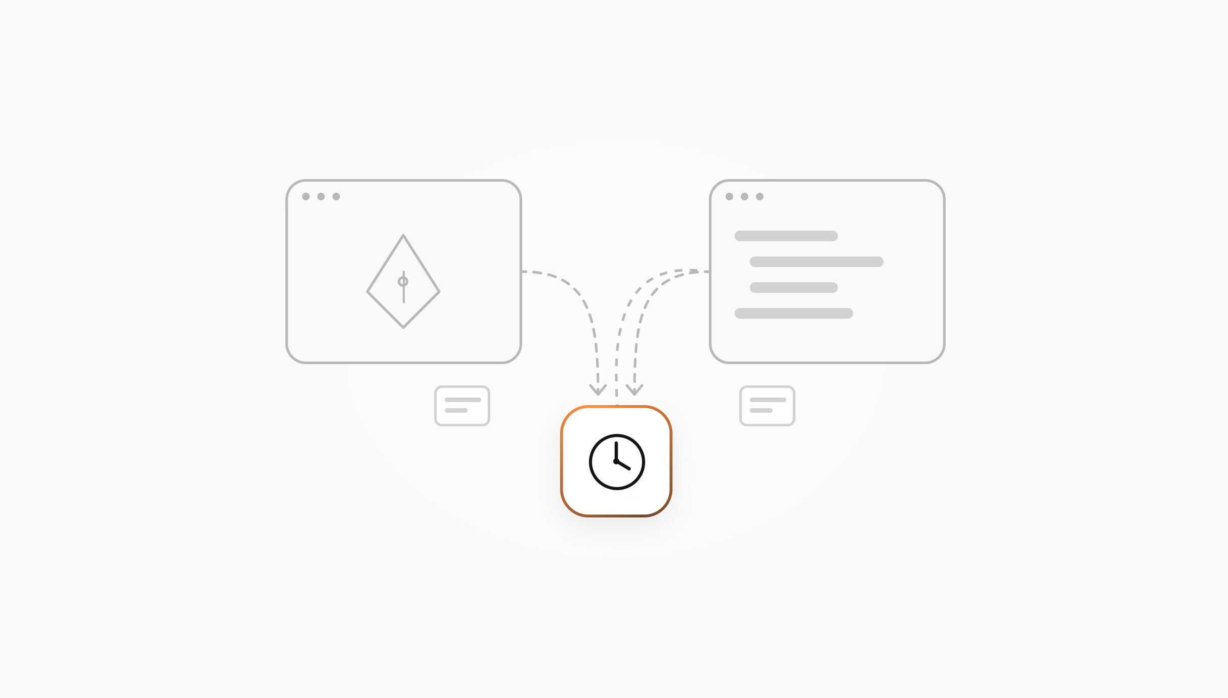
Be clear about who is doing the evaluation. In an expert competitive audit, a researcher or designer reviews the products against defined criteria. In a comparative usability study, participants attempt comparable tasks across the products. The second gives you observed user behavior; the first gives you an expert assessment. You can use both, while keeping the evidence separate.
A useful competitive audit answers questions like:
- Where might our flow be more confusing than the alternatives?
- What patterns have competitors converged on, and should we follow them?
- Where could we deliberately deviate because the category's usual approach doesn't serve our audience?
- How do competitors handle onboarding and the first core action?
UserTesting's guide to competitor studies describes how participants can try competing experiences. For the desk-research side, Maze's competitive analysis guide and UXtweak's competitive analysis breakdown offer ways to organize the comparison.
The choice comes back to your question. If you need to learn whether people can complete a task more easily in another product, plan for participants. An expert's opinion about the flow won't answer that by itself.
How to run a competitive audit
- Pick competitors. Choose products relevant to the audience and task. Direct competitors serve a similar audience with a similar offer; indirect ones solve the same job differently. Include an indirect alternative when it could teach you something useful, rather than filling a quota.
- Define the task list. Be specific about what you're comparing: signing up, choosing a subscription, or completing the first core action. Comparable goals and conditions give you a clearer basis for judging differences between products. If you add participant sessions, each task also needs to make sense in that product.
- Agree on shared criteria. Consider usability, information architecture, accessibility, microcopy, onboarding, error handling, and mobile behavior. You should explain the severity scale, define what each score means, and distinguish an observed task blocker from a reviewer's concern about a label so readers can understand both the ratings and the evidence behind them.
- Document with screenshots and recordings. A list of complaints with no supporting context is hard to act on. Annotated screens, side-by-side comparisons, and a clear scorecard let the team see where an observation came from. Record participant sessions only with their agreement.
- Investigate important assumptions with users. An expert review can identify questions for testing. When you compare tasks with participants, account for the order of experiences and how much you are asking each person to do. Keep predicted issues separate from the problems you observe.
- Translate findings into recommendations. Each finding should lead to something the team can discuss: “we should adopt this,” “we should avoid this,” or “we should differentiate here.” Explain why it matters to your product, rather than borrowing a pattern because a competitor has it.
A quick competitive audit example structure
For a concrete competitive audit report, this is a useful starting structure:
- Section 1: Goal and scope. What you're trying to learn, which products you chose, and whether the work includes expert inspection, participant testing, or both.
- Section 2: Competitor profiles. The relevant audience, positioning, features, and product context, including pricing and design system notes where relevant. Keep the detail tied to the decision.
- Section 3: Side-by-side task analysis. Screenshots and observations for the same goals, with the source of each finding identified.
- Section 4: Pattern library. Common patterns across the products. Worth adopting? Worth questioning?
- Section 5: Gaps and opportunities. Where do the available products leave the audience struggling, and what should you investigate next?
- Section 6: Recommendations. Prioritized actions mapped to your roadmap, with open questions separated from conclusions.
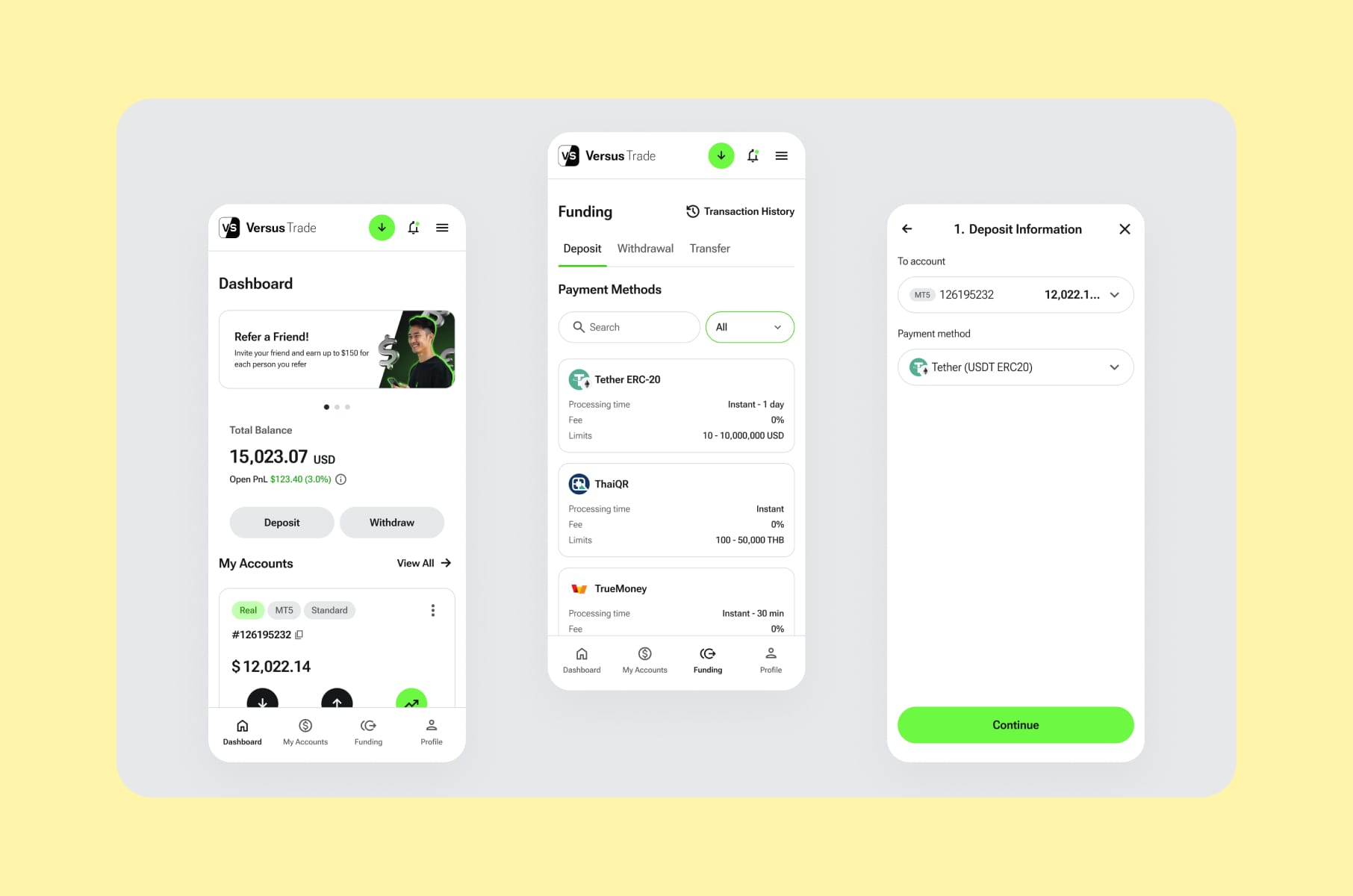
Our Versus Trade product design work covered more than 3,000 responsive screens across client and partner experiences. The case also describes post-launch UX audits. For a product with that scope, the two sides deserve attention in a comparison: a pattern that fits a client's task may be less useful in a partner workflow.
Another example comes from our Clockwork redesign. The work included an audit of the existing app and analysis of competitor websites, while the design needed to work for people who weren't finance specialists. That audience context matters when you review a category full of financial interfaces. Familiar to an expert can still be confusing to the person you're designing for.
A useful competitive audit report should help the people making product decisions. Involve the relevant product, design, and marketing stakeholders in setting the questions, so the result has somewhere to go after the presentation.
User testing pitfalls to watch for
Choosing a suitable method is a good start. The tasks, recruiting, and way you interpret the results can still weaken the study. Here are the pitfalls worth watching for.
Leading questions and contaminated tasks
If your task says, “try to find the easy checkout button,” congratulations, you've given away part of the answer.
When you describe the person's goal without naming the control, you leave room to observe how they find it themselves. “You want this order delivered to your office” leaves room to observe how someone finds and changes the delivery address. Naming the settings menu in the task removes part of what you were trying to learn.
The same care applies to follow-up questions. “What were you trying to do?” gives someone room to explain. “Was that button confusing?” offers them your explanation first.
Recruiting friends and family
A startup classic. Friends and family may be nice: they'll laugh at your jokes and tell you the onboarding feels great. Their feedback can help you notice a problem, but it doesn't replace recruiting people who fit the actual use case.
Your recruiting criteria should reflect the relevant behavior, responsibilities, and experience, so you can hear from people who fit the use case. If an account admin sets permissions and an end user only sees the resulting workspace, those are different tasks to consider. Someone with spare time and a willingness to help may represent neither.
The "five users is enough" mistake
Five participants can be a useful starting point for a typical qualitative usability round with one user group. NN/g makes that recommendation in that context, rather than as a sample size for every research question.
The familiar claim about finding most problems has conditions. In Laura Faulkner's study, different samples of five participants found between 55% and 99% of the problems in that particular dataset. It illustrates the variation a single headline number can hide.
Plan around the groups, tasks, risks, and decisions your study needs to cover. Measuring a completion rate with useful precision, or comparing variants, needs a sample plan for that purpose. Adding a second user group doesn't become a solved problem because your total has reached a neat round number.
Skipping moderation skills training
Running a session is harder than it looks. You need to keep the person comfortable, understand what they're doing, and resist explaining the interface when they hesitate.
Giving people time to finish a thought lets you hear their explanation before you step in. Neutral follow-ups help you explore it without suggesting an answer; you should also record any help you provide and distinguish what you observed from your interpretation. There isn't a speaking-time ratio that can do the moderation for you.
Replacing “did you like it?” with “what were you trying to do?” is a decent place to start.
One round and done
You should decide how you'll follow up after making changes. A small testing round can help you check whether the revised design addresses the issue you observed and whether anything else now gets in the way.
The cadence should fit your product and the decisions in front of you. Aim for research the team can use as the work develops, rather than treating one large study as permanent reassurance.
Where AI fits into modern user testing methods
AI can do a lot of useful work in a research workflow, but it's important to understand what the tool contributed and check whether its output supports the decision you need to make.
In Maze's Future of User Research 2026 survey, 69% of respondents reported using AI in at least some research projects. That describes the people who answered the survey; it doesn't establish adoption across every research team.
Where AI can help the most:
- Transcription and tagging. A transcript can make recordings easier to work with. Before you use a transcript in your analysis, you should check names, unclear passages, and any quotes you plan to use against the source material so you can confirm what the participant actually said.
- Finding candidate patterns. Summaries and clusters can suggest themes to investigate across sessions. Keep the recordings or notes available so you can check the theme against what people actually said and did.
- Drafting reports. A first structure can be useful, provided someone checks the evidence, interpretation, and recommendations.
- Assisting with sessions. AI moderation tools can ask questions and follow-ups. Maze documents that capability, including follow-ups based on a participant's answer. That tells you the feature exists, not that its results will be equivalent to a skilled human moderator's in every context.
Synthetic personas deserve a separate distinction. An AI-generated response may suggest a question or assumption worth investigating. It isn't evidence that a real person understood the concept or completed the task. Keep it out of the participant findings.
Where the work still needs your judgment:
- Severity and priorities. Check what failed, who it affects, and what the consequences are before assigning a priority.
- Business context. A “broken” pattern in one product can be appropriate in another. The interpretation needs that context.
- Accessibility. Include the relevant users, devices, and assistive technology when those are part of the experience. A generated review doesn't establish how someone will use it.
- Follow-up quality. A tool can produce a question; the research team still needs to assess whether the session explored the right uncertainty without leading the participant.
Use AI where it helps with the work itself, and keep the evidence traceable. Thankfully, you still have a say in what the findings mean.
How we run user testing at Merge
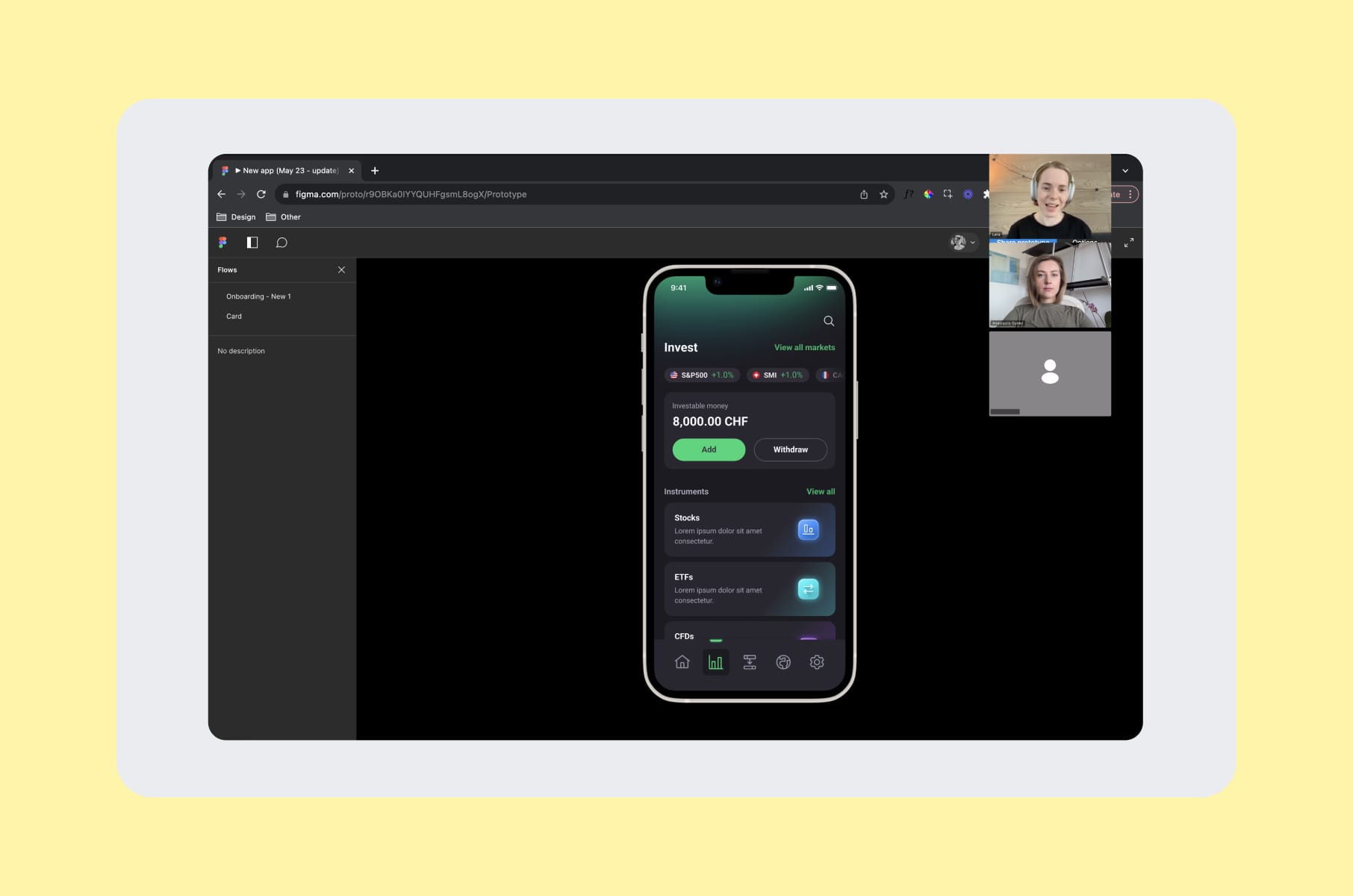
Our user research services use a four-step framework. The research question and the work needed to answer it determine the scope.
- Preparation. We define the research goals and prepare the materials, including questionnaires and screening forms. For a usability round, a focused goal, realistic tasks, and clear assumptions give you something useful to investigate. If the goal needs several unrelated questions to explain it, it may need a narrower scope.
- Audience and recruiting. We identify the intended audience and recruit relevant participants. Responsibilities and behavior matter here: the right person for a buyer interview may be different from the person who uses the feature every day.
- Interviews and sessions. The work can use interviews, questionnaires, recordings, and other methods suited to the question. Decide what needs a conversation and what you need to observe in use, rather than setting a fixed moderated/unmoderated split before you know the problem.
- Analysis and the plan. We interpret the findings and turn them into an actionable plan. Depending on the scope, that can include an analytical report, an insights repository, and a prioritized backlog. The team should be able to connect a recommendation with the observation behind it.
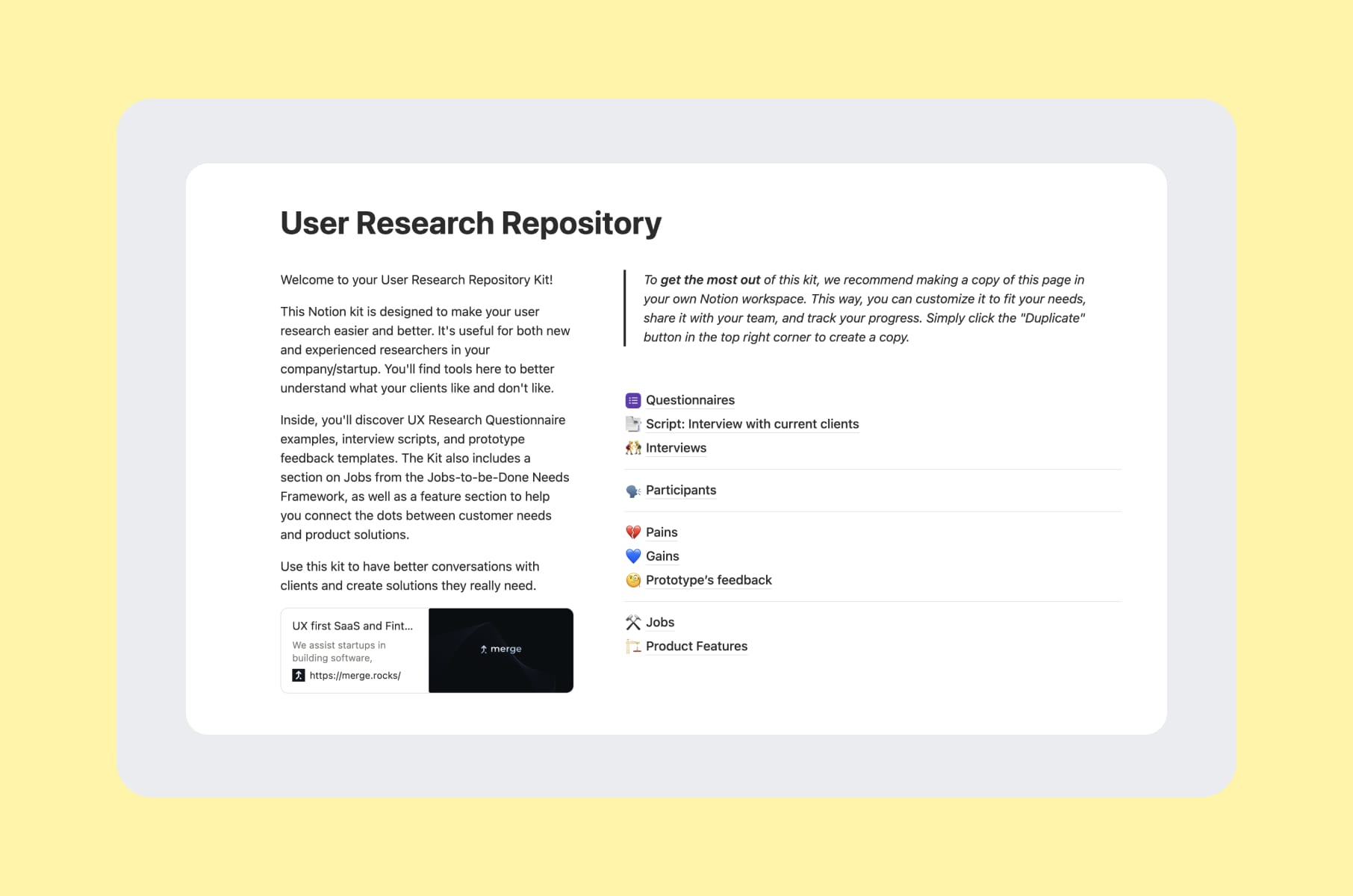
If you want a little sneak peek at resources for organizing this work, our User Research Repository Notion kit includes questionnaires, interview scripts, and Jobs-to-be-Done materials.
A few engagements show how research fits into product design:
- Capable. Our work on the Prompt Builder included interviews about how people use AI and changes to simplify the experience.
- MO Widgets. For the Shopify navigation app, the work included reviewing Shopify navigation apps and customer feedback, a UX audit, and redesign. That gave the project more context than looking at the existing screens alone.
- Invisibly. The B2B and B2C research examined the audiences' needs, behavior, and expectations alongside work on dashboards and a shared design system. A study plan needs to account for those audience differences.
- WeFight. Our WeFight work included a stakeholder interview, research into user behavior, and the design of a disease-related quiz experience. Understanding the audience and the context of the questions is part of choosing a suitable research approach.
You can browse the rest in our product design case studies.
Wrap-up: pick the method, then pick the partner
User testing methods should follow the question you're actually asking. The wrong method, asked confidently, can give you the wrong answer (also confidently), and that's what hurts your roadmap.
- If you're early: explore how people understand the concept, then observe use once you have something they can try.
- If you're mid-build: test the riskiest flow, with moderation where you need to investigate and an independent task where the setup supports it.
- If the product is mature: connect research to the changes you're considering, using experiments when the question, traffic, and measurement suit them.
- If you're mobile-first: test on real phones in the context that matters to the task.
- If you're preparing a redesign: consider a competitive review when it answers a useful question, and add participant testing where you need behavioral evidence.
Our team can help scope that work through our user research services. The findings can also inform a broader UI/UX design engagement.
If you're starting with your own team, the research kit below gives you resources to organize the questions and findings.
FAQ
What are the main user testing methods?
Task-based usability testing, first-click testing, and tree testing can help you investigate how people use a design. Concept and preference testing answer questions about an idea or alternatives; A/B experiments compare a defined outcome; diary and longitudinal studies follow an experience over time. Think-aloud is a protocol, RITE is an iterative evaluation approach, and heuristic evaluation adds expert inspection to the wider toolkit.
What is the difference between user testing and usability testing?
The terms are often used interchangeably. In this guide, user testing is the broader term for evaluating an idea or experience with people, while usability testing focuses on observing them attempt realistic tasks. When you scope a study, agree on the question and evidence you need so everyone understands what the proposed “test” will actually involve.
How does remote mobile usability testing work?
A participant attempts tasks on a phone while a researcher observes through screen sharing or reviews a recording afterward. The setup may involve a testing app, a mobile browser, or a video call, depending on what you are testing. Checking the device, permissions, recording capabilities, and audio before the session helps you work out what you'll be able to observe. Consider a second camera if observing the physical interaction matters to your question.
How many users do I need for a usability test?
It depends on the question, user groups, tasks, and kind of conclusion you need. Five participants can be a starting point for a typical qualitative round with one group, followed by iteration. A study covering distinct roles needs to account for them, and quantitative estimates or comparisons need a sample plan based on the required precision and decision. No single count makes all of those studies sufficient.
What is a competitive audit UX pass and when should I run one?
An expert competitive UX audit reviews other products against defined tasks and criteria. It can help you understand alternatives, identify patterns, and decide what to investigate during a redesign or product change. If you need to know how people actually perform across the products, add a comparative usability study and keep those observed findings separate from the expert review.
What does a competitive audit example look like in practice?
A defined goal and scope, relevant competitors, and a shared task list give you a basis for comparing products. Annotated screenshots, clear scoring criteria, and a record of which findings come from experts or participants help readers understand the evidence behind the recommendations. A useful report includes competitor context, side-by-side task analysis, patterns, gaps, and prioritized recommendations. Choose the number of competitors around the question and available resources.
Can AI replace user testing?
AI can assist with transcripts, candidate themes, reports, and some moderation tasks. Someone still needs to judge whether the study design and findings support the decision. An AI-generated persona response doesn't establish how a real participant will behave. Use the tool's output as appropriate to its role, check it against the evidence, and involve real users when the question concerns their experience.
What does user testing actually cost?
The cost depends on recruiting difficulty, incentives, study format, tools, planning, facilitation, and analysis. An unmoderated study still needs preparation and review; recruiting a specialist audience can take more effort than recruiting a broadly available one. It's worth asking for a scoped estimate that identifies the participants, tasks, deliverables, and rounds of work, so you can see what the budget covers. If you run the study yourself, you'll also need to count your team's time alongside platform and participant costs.