Website and product design for a new CFD broker
About the project
About Versus Trade
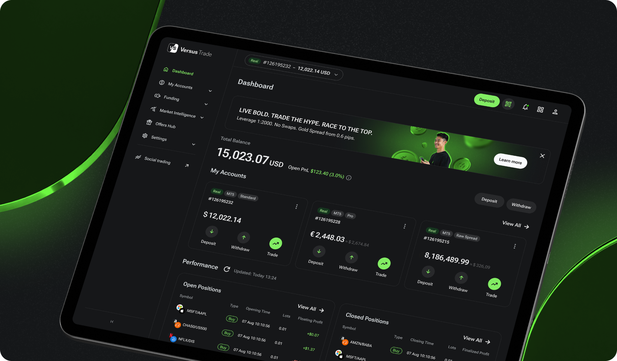
Versus Trade lets users trade asset‑versus‑asset CFDs and track performance through web and mobile dashboards. The platform is meant for the Asian and MENA markets, with a focus on Gen Z and youth audiences.
Visit Versus TradeChallenge
A core challenge was to create a modern, "hype" visual identity that would appeal to a young, tech-savvy audience in the target markets, differentiating it from traditional brokers. There were also very few design references for the unique "versus" trading model. We needed to plan and design two products (Client Area and Partner Area), plus two marketing websites. The interfaces had to feel quick, handle heavy data tables, redirect to MetaTrader 5, and support several languages and right‑to‑left layouts.
What Merge delivered
After branding, our team delivered a working MVP covering the needs of both audiences. Across nine months, we designed more than 3,000 responsive screens: client area, partner area, dashboards, funding flows, tables, and reports. We also designed the public client site and a partner marketing site.
Full branding caseTech stack
Figma.
Work process
We started with information architecture and defined how users open an account, fund it, trade through MT5, and monitor the order status.
Data-rich interfaces
The Partner Area pays partners via commissions tied to referred trading volume, so they need dense tables and filters. We introduced highly filterable, developer-extensible tables built from reusable templates.
Traders see only essential stats, while partners dive deeper without opening another tool. Design tokens keep spacing consistent, so a column added today inherits the right style automatically.
Products for two audiences
While retail traders want clarity, partners need metrics. We solved the tension by reusing components with role‑based defaults. The dashboard widget shows balance for a trader but commission totals for a partner.
Copy and iconography were adjusted using the client‑provided locale resources, and we implemented full RTL mirroring. This proves that careful UX writing can meet very different needs without duplicating screens.
In conclusion
Outcome
Versus Trade launched on schedule, onboarded 400 active users, and now demonstrates the platform at fintech expos across Asia. With a living design system and ongoing audits, the product keeps improving while development stays efficient.
The MVP went live in nine months; the public website followed in two. We now provide continuous post‑launch UX support and audits.
Final words
Special thanks to the Versus Trade team for their trust and collaboration.
You may also like
Quantango Technologies
Quantango Technologies innovates trading mechanics. We built a website to help them better communicate their story and attract talent.
RapidDev
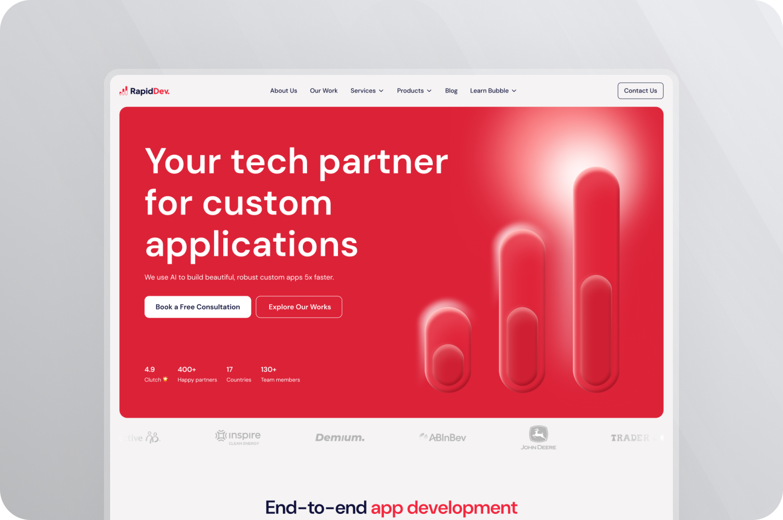
RapidDev, a no‑code agency, hired Merge to redesign its site and unify marketing assets—clarifying services and templates to support sales.


