Clockwork. Web app improvement and website redesign for financial clarity


About the project
A journey to simplify FinTech for both businesses and accountants
Clockwork first approached us with their web app problem - it was too difficult to use, and important features were hard to discover. The second request came later - to redesign their website, refresh its look, and make it more modern, appealing, and interactive.
Who is the client? Clockwork automates financial planning and analysis, building out financial projections and insights based on accounting data. Why Merge? a) A substantial expertise in FinTech and a proven track record (several successful case studies) with similar projects, and b) Prior positive collaboration with the client.
What exactly Merge did
Web app improvement. We improved usability and feature discoverability for non-financial users. Website redesign. Next, we modernized the outdated site, boosted interactivity, and increased conversions. To find out how we did it, scroll down to check out the work process.
Tech stack
Webflow
Visit Clockwork


“Their ability to translate complex financial concepts into an intuitive user experience was particularly noteworthy, as was their proficiency in Webflow development.”
Fady Hawatmeh
CEO at Clockwork


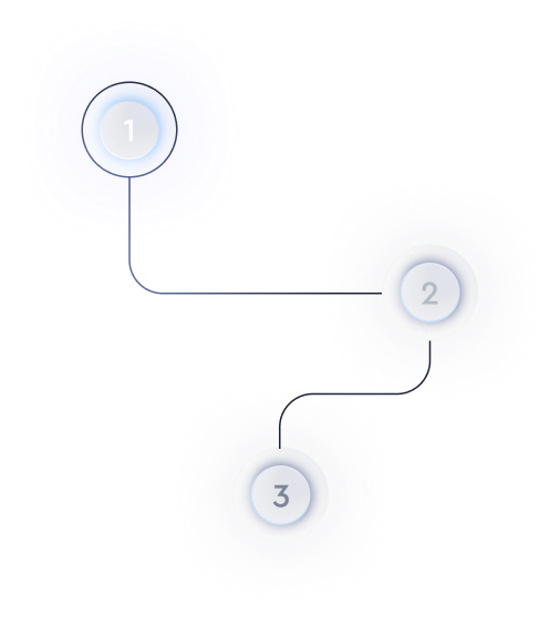
Work process (Web App)
We began with discovery calls with stakeholders, where we discussed priorities and identified the key features that needed attention.
Clockwork Website - Before
Clockwork Website - After
Work process (Website)
We started by discussing the client’s expectations and preferences for the site.


Helping convey the unique advantage of the web app
The challenge was to make the the app’s design both work for users who typically have a CFO or someone well-versed in finance and also bridge the gap for people without a financial background by using AI to make finance more accessible. Both target audiences have very high expectations regarding the price-to-value ratio, and our job was to deliver the experience they expected.


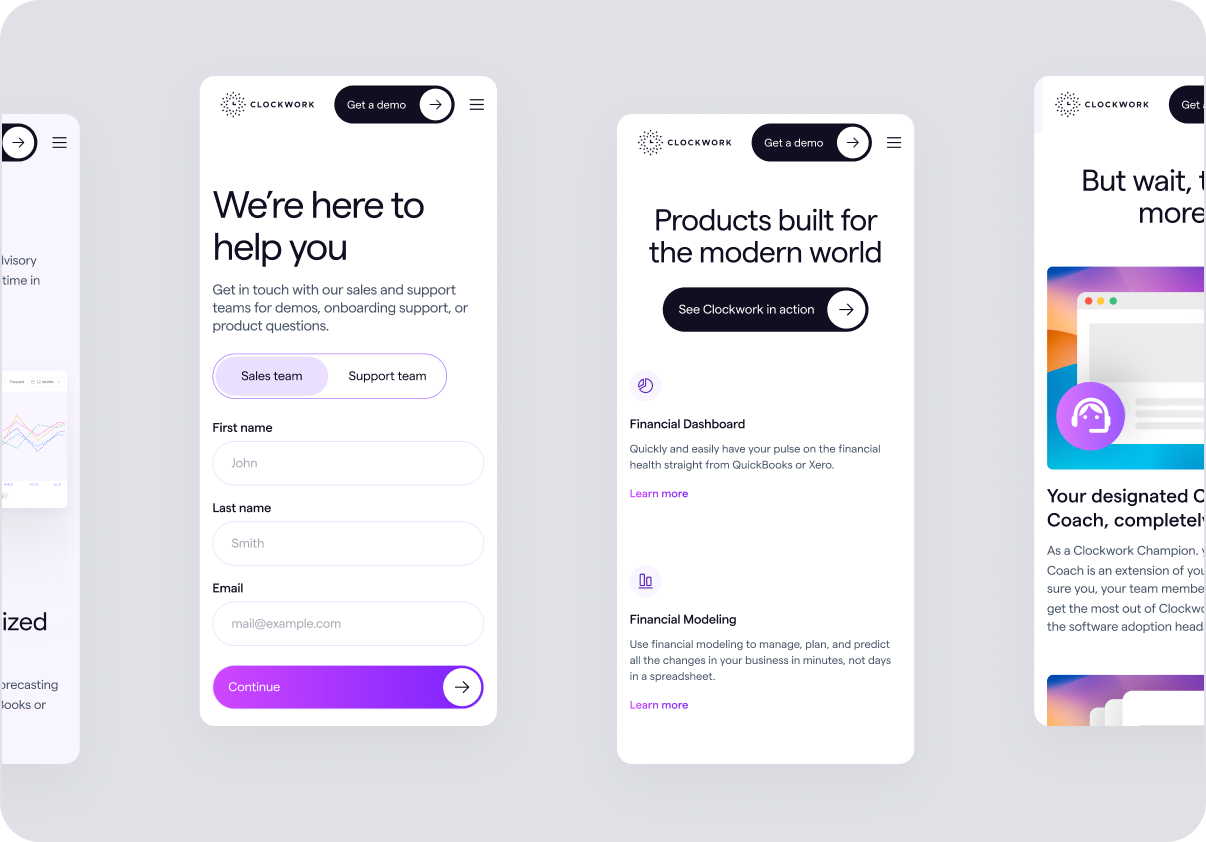
From the website’s outdated UI to a modern FinTech appeal
At the time, the website’s UI was very outdated and static. With more features to showcase and a need to boost conversion rates, this redesign was one of the main priorities. We added a playful gradient palette with soft, lilac hues as a creative element. This approach was atypical for the financial sector (which often leans toward dark, intense schemes), but it worked perfectly for Clockwork’s light-theme design.


Clockwork UI Design
Illustrations and the clock theme
Besides updating the color palette and typography, we used the clock symbol from their logo as a central visual metaphor throughout the website. For example, we incorporated animations where the clock icon rotates as users enter the site. On the About page, the clock served as a slider to showcase key events in Clockwork’s history. We even added an Easter Egg on the 404 Error page—a nod to Salvador Dalí’s melting clocks.
In conclusion
Final words
The client was very satisfied with the outcome, particularly commending the clean visual style, improved navigation, and increased interactivity. Clockwork now has a modern, flexible design that meets the needs of both casual users and financial experts. Early feedback also praised the simpler interface, and the client noted a preliminary doubling of website conversions after launch.